volmi ecommerce redesign
A data-driven redesign that turned a broken checkout into a converting multi-brand supplement store
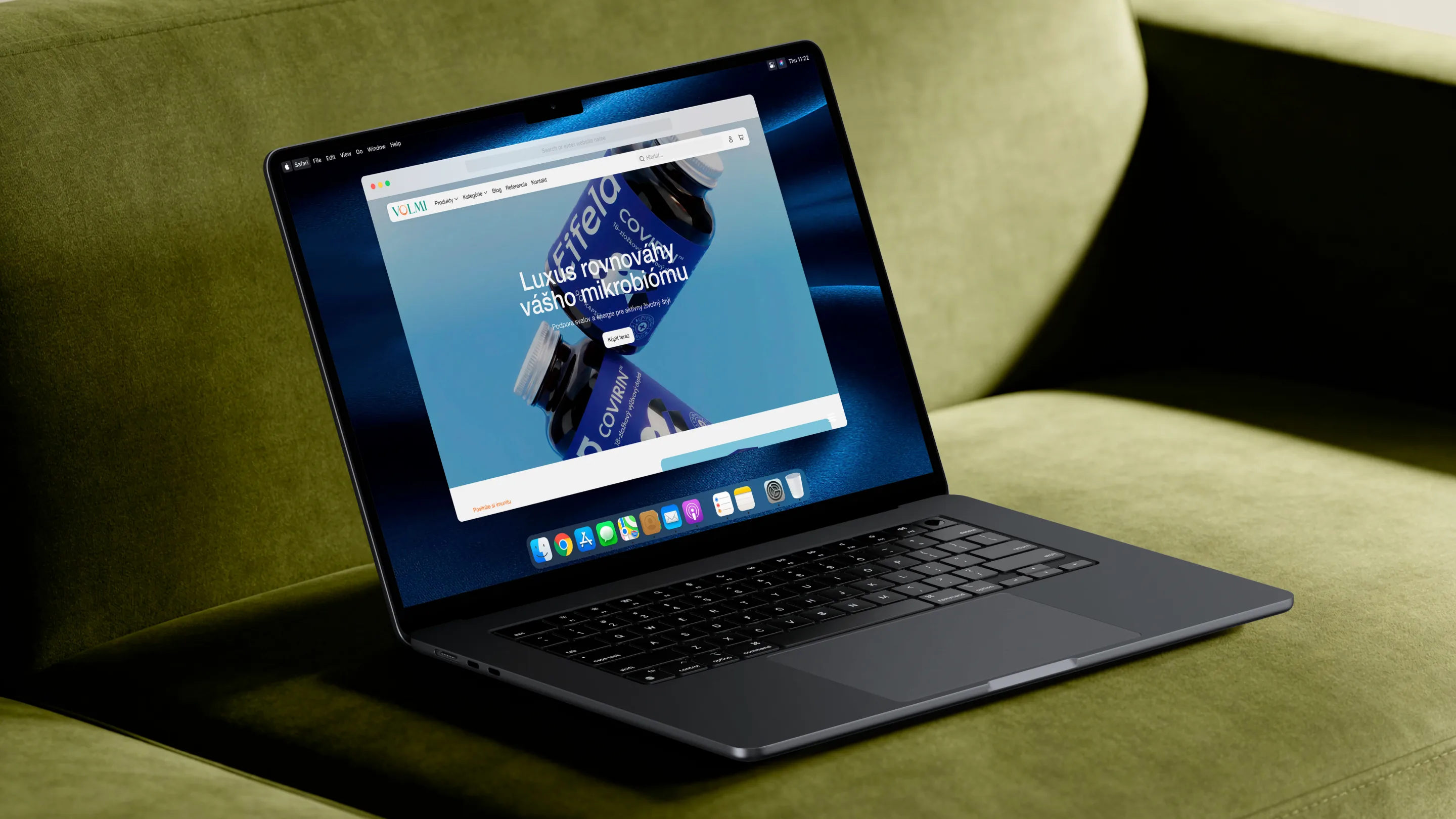
Subject
VOLMI is a Slovak e-commerce store selling supplements across several in-house brands — Biomie, Eifela, BACK2LIFE, Magnesium-Diasporal, Inflomega and Imurin — under one storefront. The store already existed, but its checkout was broken: shoppers browsed and added products to cart, then almost nobody completed an order. We redesigned the store end to end — UI/UX, frontend, backend and product analytics — and rebuilt the checkout around what the data showed was actually failing.
What have we done
- Audited the existing store with product analytics to find exactly where shoppers dropped off before completing an order.
- Redesigned the UI/UX across the storefront, product pages, cart and checkout.
- Rebuilt the checkout flow end to end — fewer steps, clearer pricing, no unnecessary friction before payment.
- Developed the frontend and backend for the new store, including product variants, cart and order confirmation.
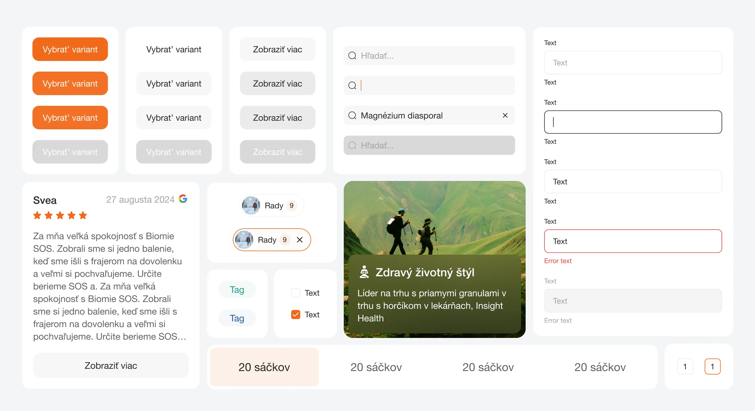
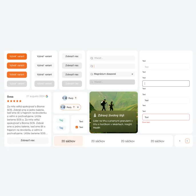
- Delivered a full design system — buttons, inputs, cards, tags and states — so VOLMI's team can extend the store consistently.
- Reworked on-page SEO across product and brand pages.
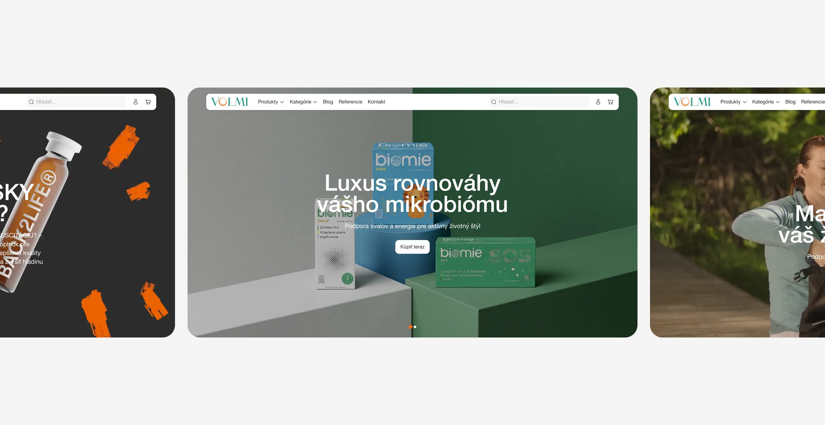
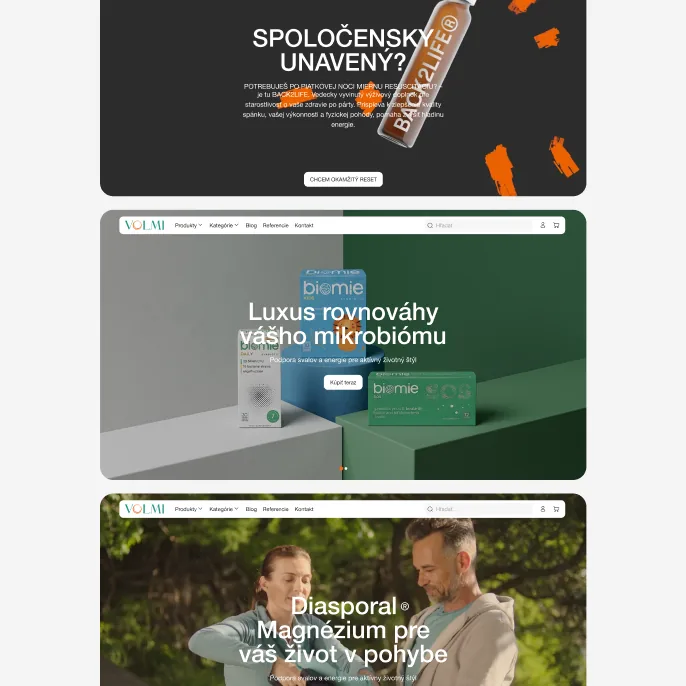
Task
Before the redesign, VOLMI's checkout converted at effectively zero — the team could see visits and cart adds, but completed orders were flat at zero a week. The store carries six different supplement brands under one roof, so any fix had to work the same way regardless of which brand a customer arrived through, and it had to be grounded in what shoppers were actually doing, not guesswork.
Solution
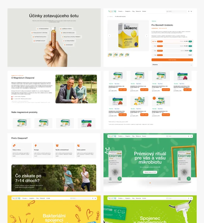
We started with product analytics — instrumenting the funnel to see exactly where people left: which step, which device, which brand's product pages. That data pointed to the checkout itself as the main failure point, so we rebuilt it, then cleaned up the product and cart pages feeding into it. The rest of the store was redesigned around the same system: consistent brand tiles, product cards, and a shared UI kit, so all six brands feel native to the store instead of bolted on. The checkout went from zero completed orders a week to 3–4 carts a week at an average order value above €60, alongside a 25% lift in traffic and a matching rise in conversion rate.
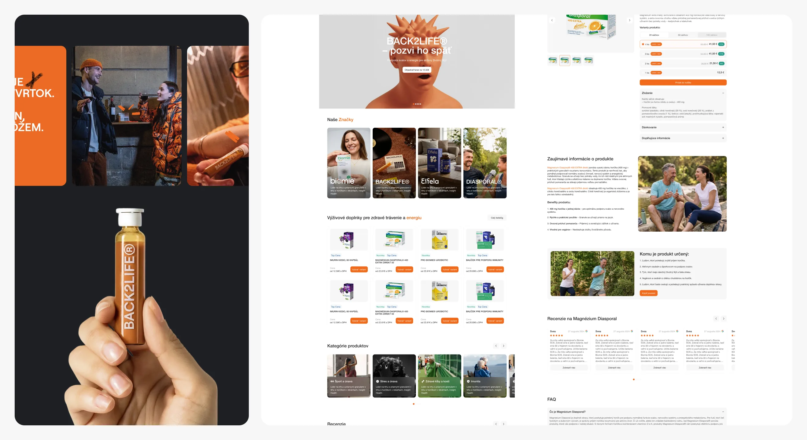
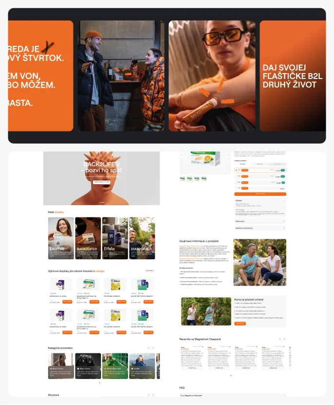
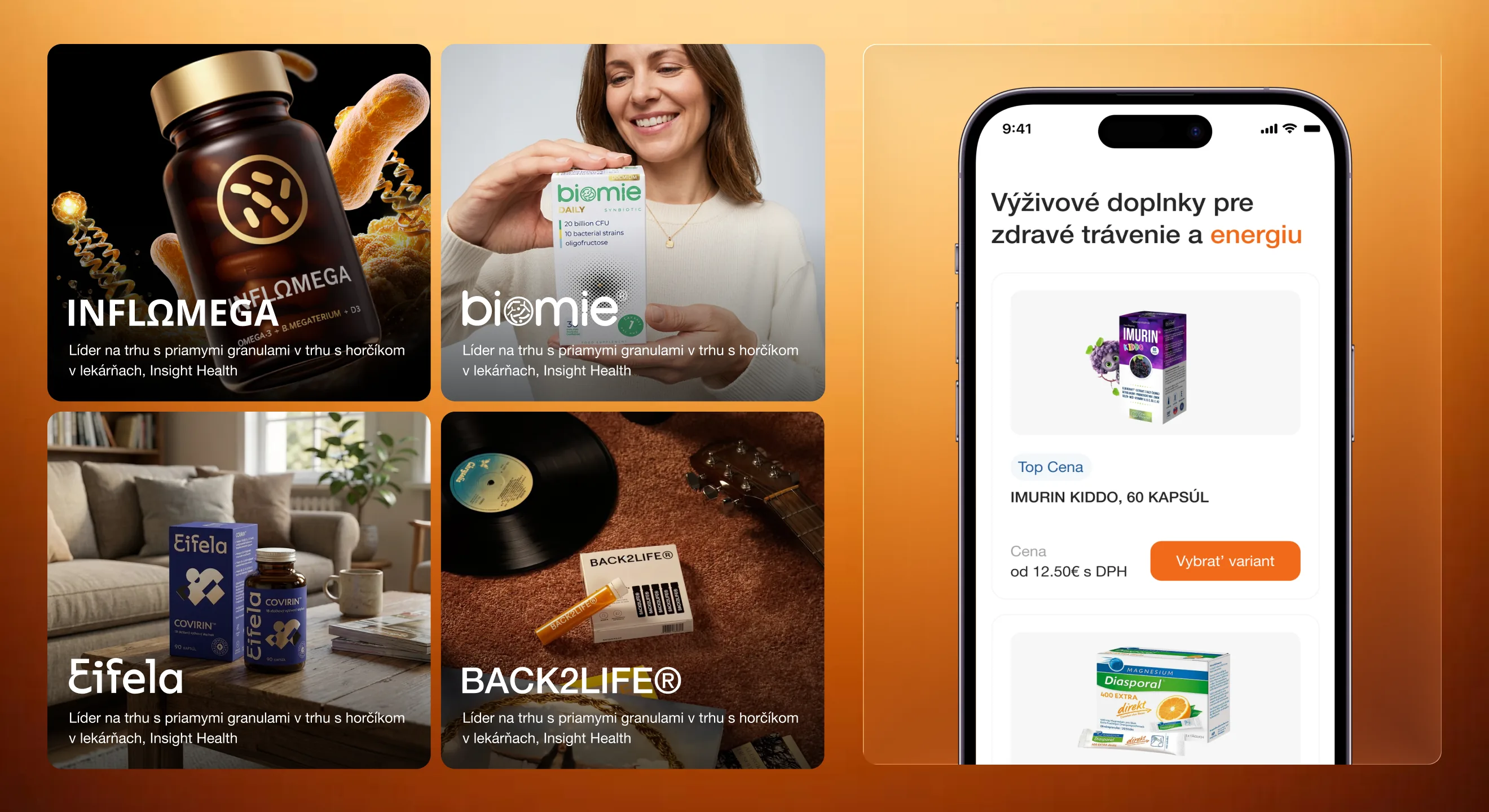
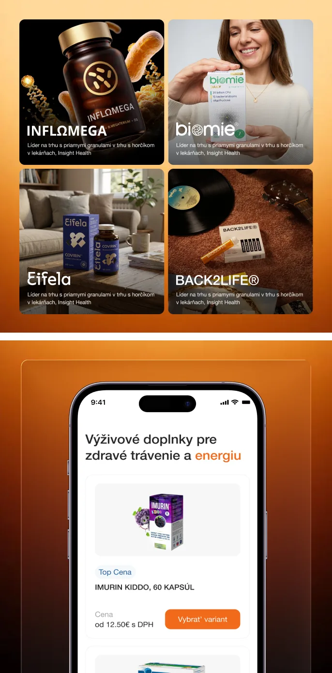
The six brands sit side by side on a shared "Our Brands" section on the homepage, each with its own tile and positioning line, then link through to category pages built around use cases — sport and fatigue, digestion, energy — so a shopper can find what fits their situation instead of hunting for a specific product name.
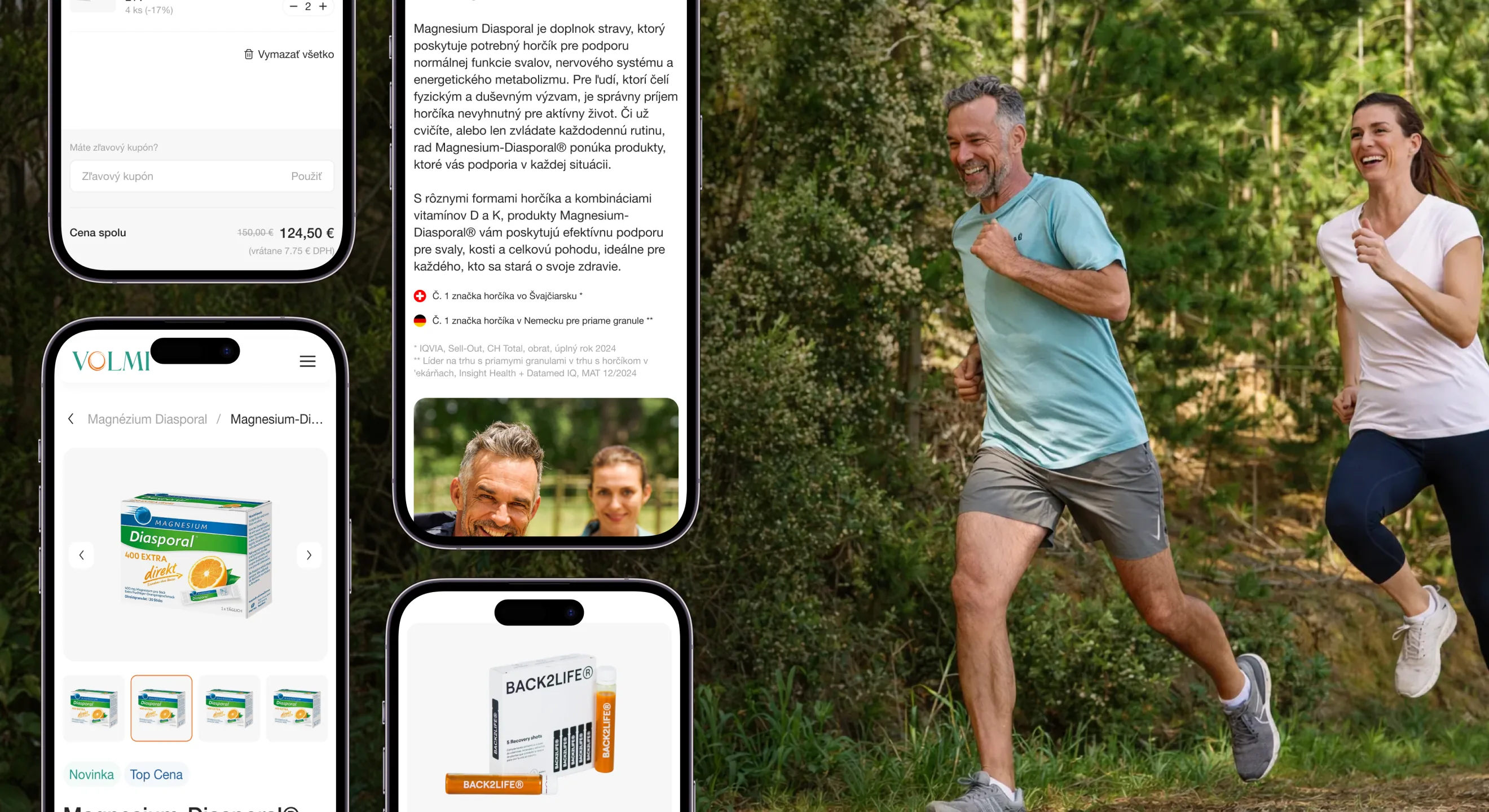
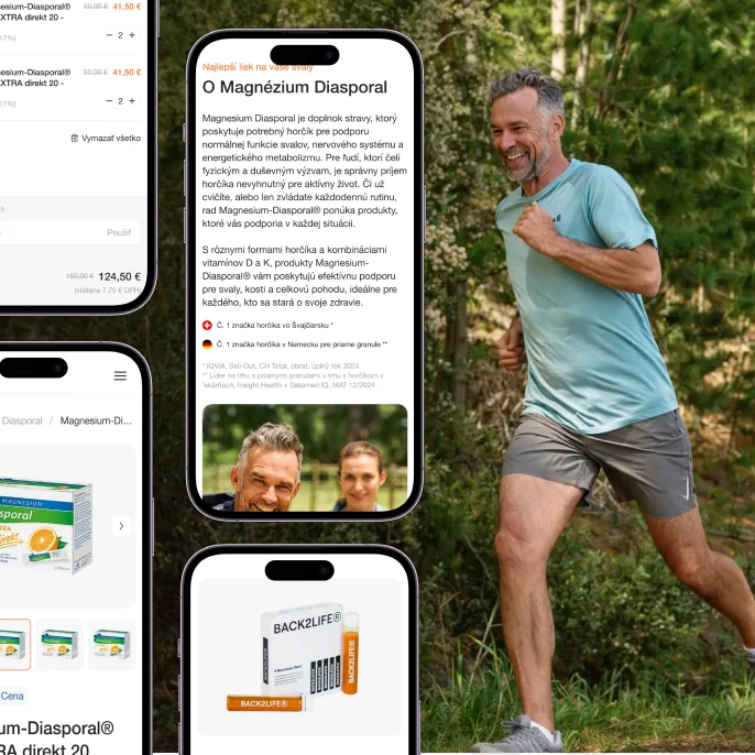
The cart carries a coupon field and a running total before checkout, and every product page backs up its claims with specifics — dosage, certifications like "No.1 magnesium brand in Switzerland," and the lifestyle context the product is meant for — rather than generic supplement copy.


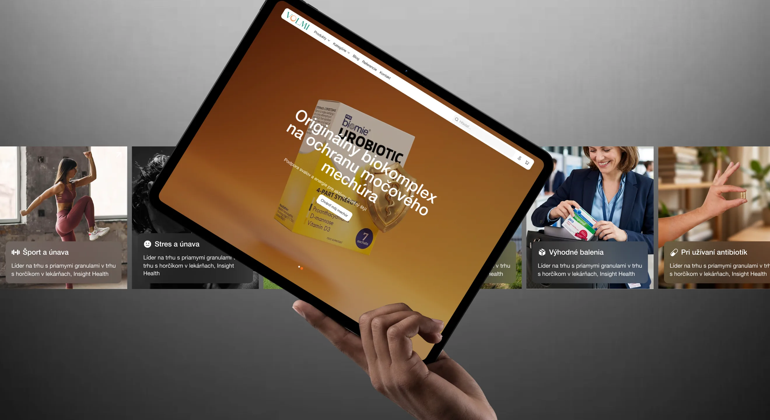
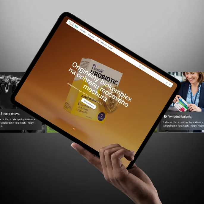
Category navigation is built around real-life triggers rather than product taxonomy — sport and fatigue, stress, discounted bundles, antibiotics recovery — so the store guides a first-time visitor toward the right product instead of assuming they already know what they need.
Each brand also gets its own story: ingredient breakdowns, ritual-style banners, and benefit call-outs like "what to expect after 7–14 days" — content built to be paged through and refreshed as VOLMI launches new products, without a developer touching the layout.
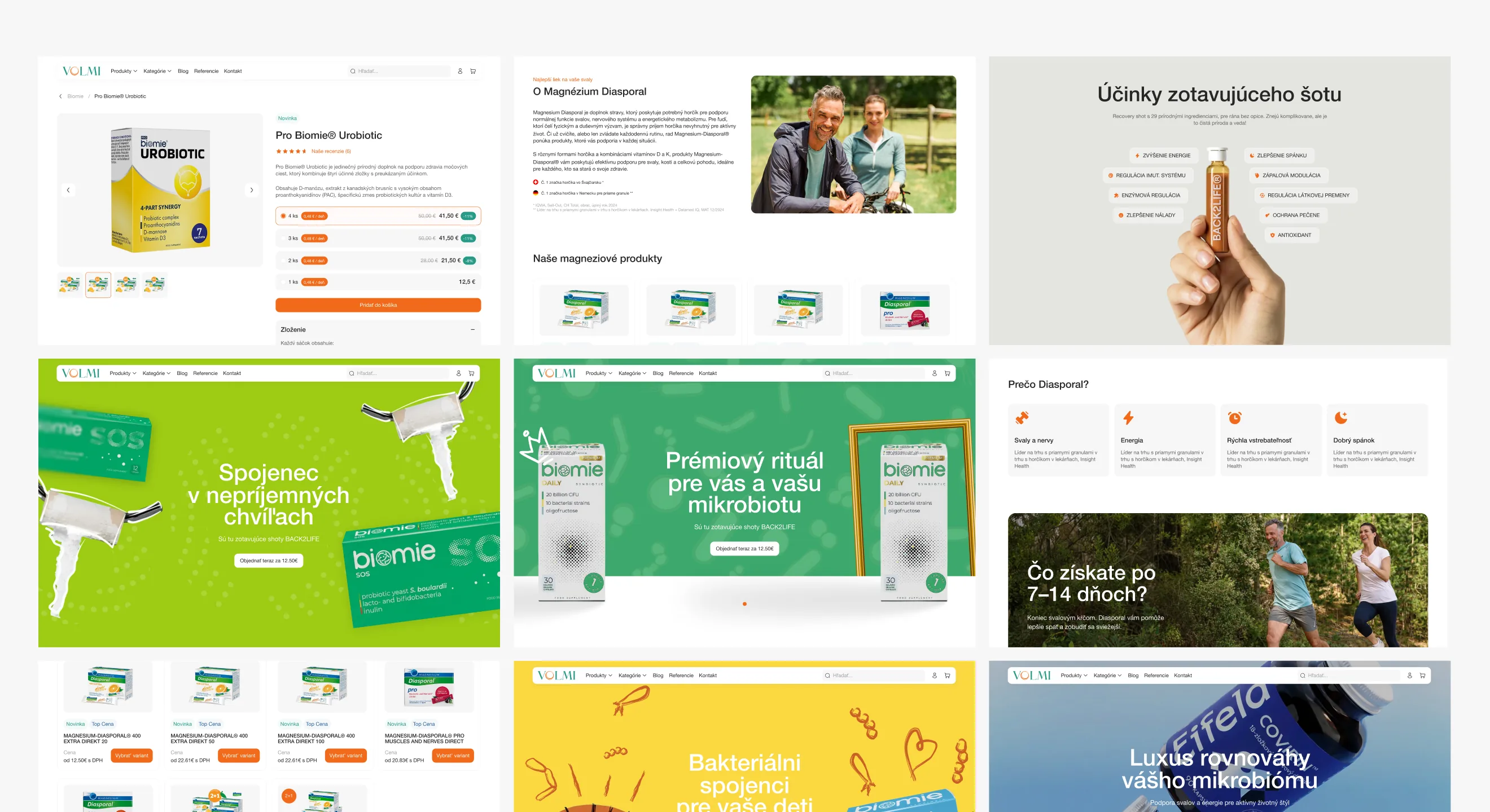
The whole redesign runs on one design system — buttons, inputs, tags, cards and error states defined once and reused across all six brands, instead of every product page improvising its own look.
That's what made the checkout fix stick: once the funnel was rebuilt on shared components, VOLMI's team could keep shipping new product pages and promos without reintroducing the friction we'd just removed.
//websters
Our team are developers who are passionate about growing your business by bringing the designers’ awesome ideas to life. The QA-testers make sure the ideas are not fucked up, and the managers are managers.
instagram
Andrej C.
Founder


Tim G.
Manager


Alex H.
Frontend Developer


Nikita L.
CTO


Nikita K.
Backend Developer


Daniil K.
Designer


Valeria R.
Designer


Vladimir K.
Backend Developer


Denis B.
Mobile Developer


Zhenya N.
Backend Developer


Oxana C.
Frontend Developer


Yulia I.
Designer