mb orc group brand & website
Brand identity and a website with an equipment catalog for a heavy machinery supplier
Subject
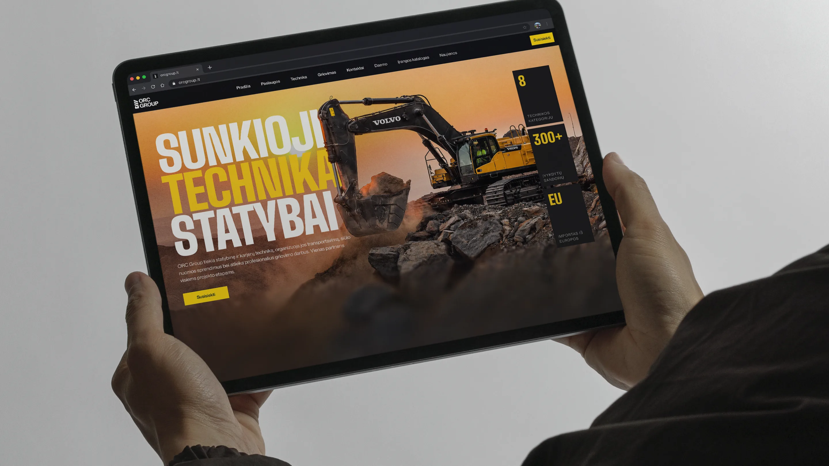
MB ORC Group is a Lithuanian heavy construction machinery supplier — selling and renting excavators and telehandlers, distributing Daemo-branded attachments, and running demolition projects across the country — built from scratch with no prior brand or website. We designed the identity and built the full site: equipment catalog, rental listings, demolition services, and product pages with technical specs.
What have we done
- Designed a brand identity from scratch — logo, black-and-yellow visual system, and photography direction.
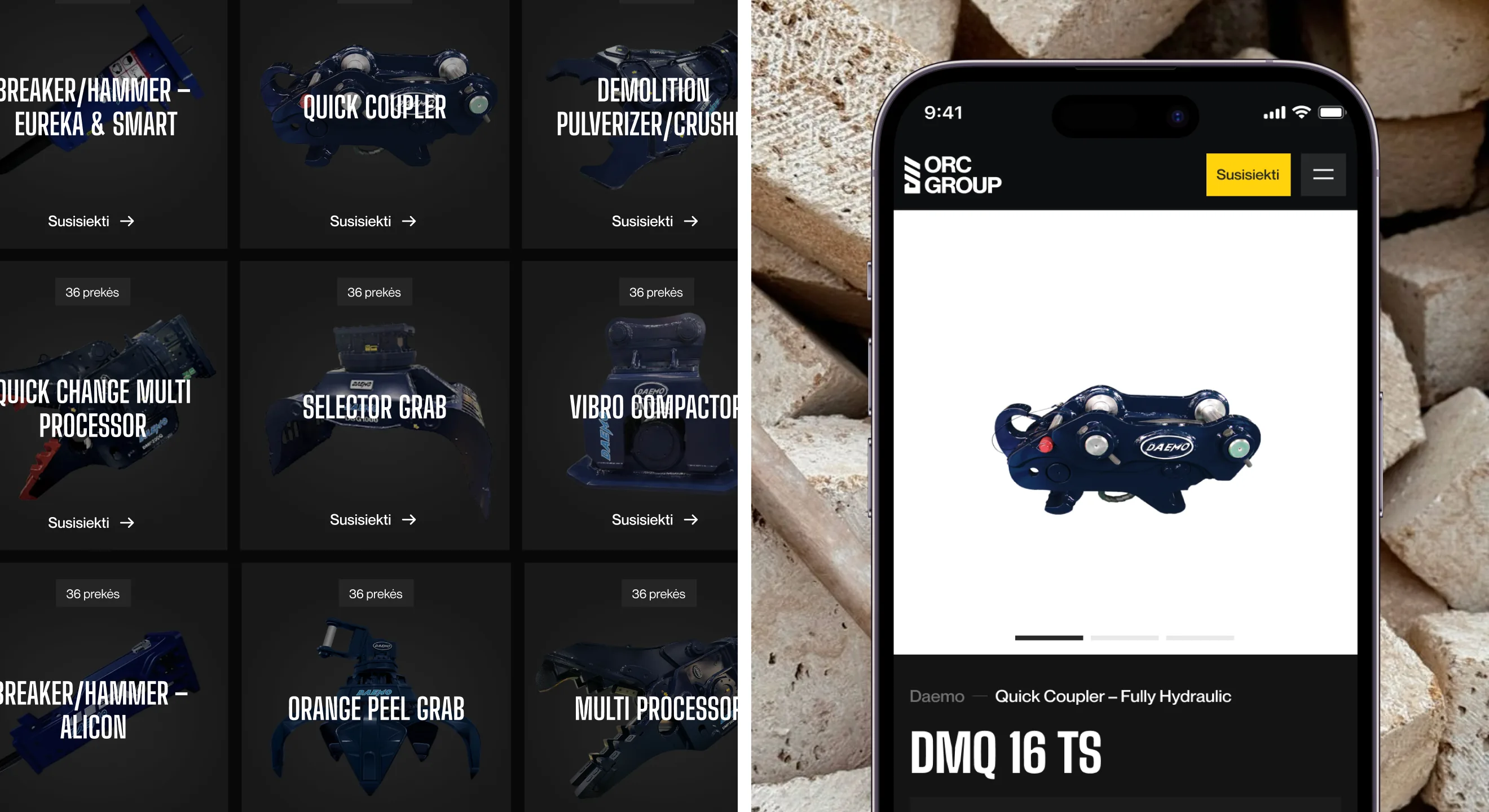
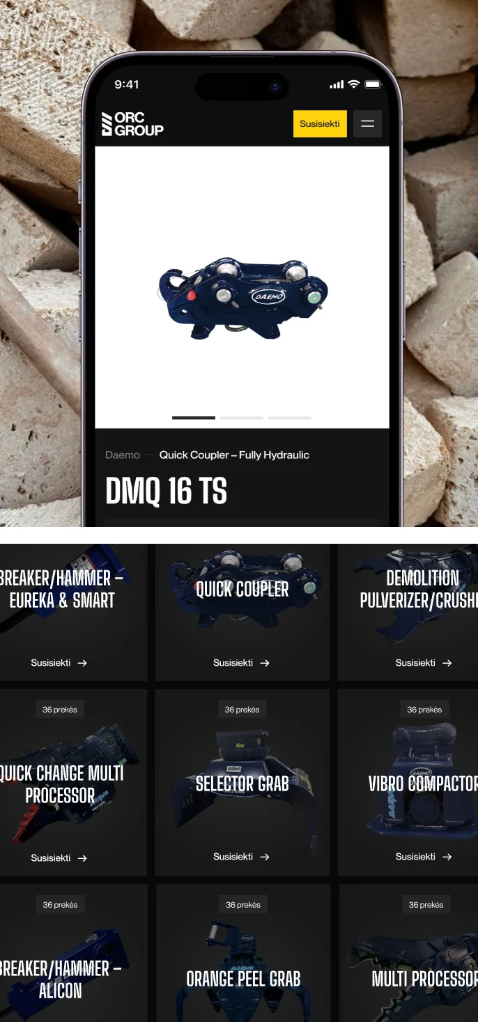
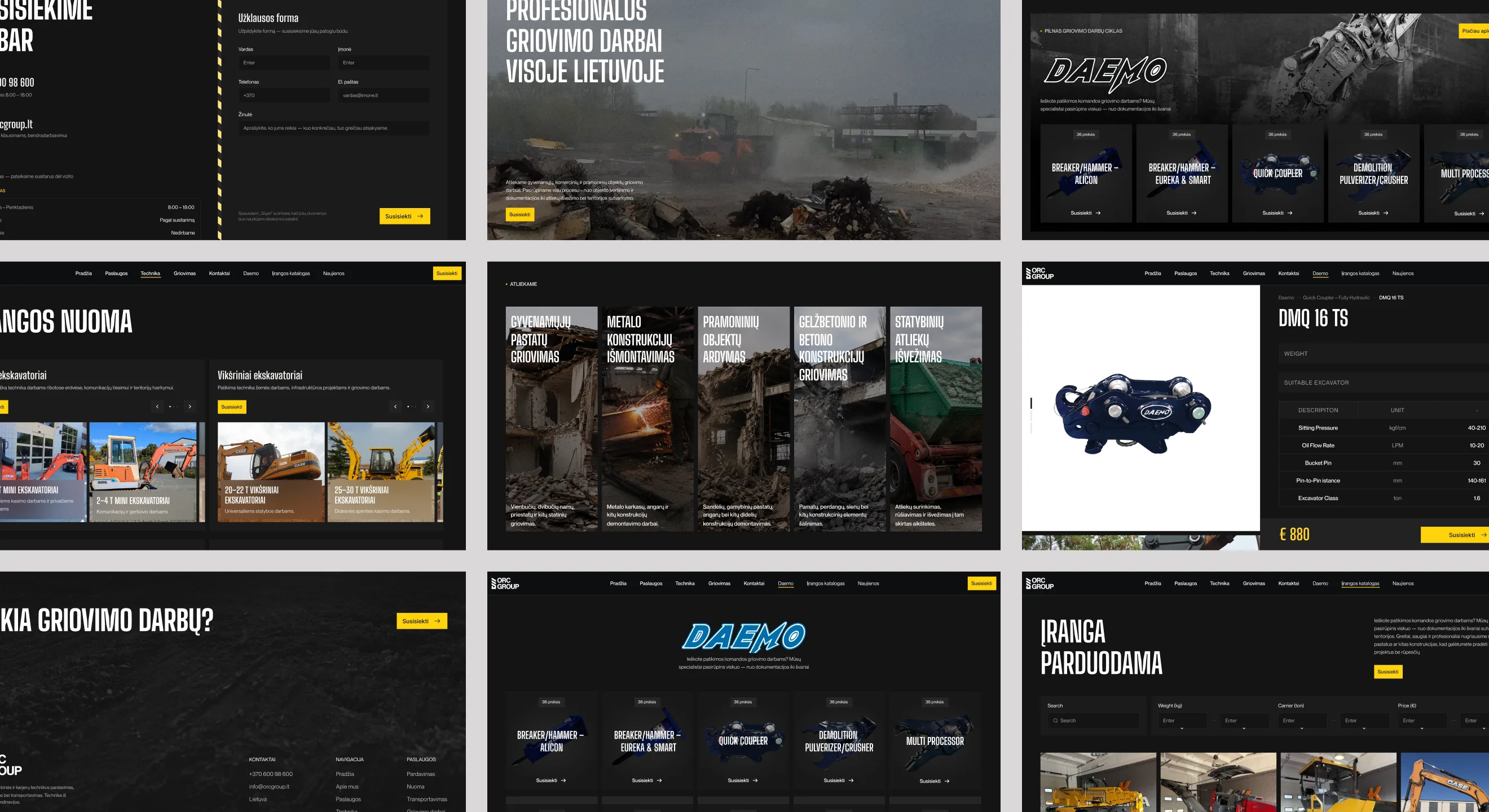
- Designed and built the equipment catalog — searchable by weight, carrier size and price, with individual product pages carrying full technical specs.
- Designed and built the rental section, organized by equipment class (mini excavators, tracked excavators) rather than by brand.
- Designed the demolition services (Griovimas) section, covering residential, industrial and structural demolition work.
- Built the contact and request-a-quote forms that tie every page back to a lead.
Task
MB ORC Group had a real, established equipment business — sales, rental, demolition, an attachment distribution deal with Daemo — but no brand and no website to represent any of it. Selling heavy machinery to contractors is a trust business: buyers want to see specs, availability and a company that looks like it has been doing this for years, not a template. That had to be built from zero, brand and site both, in two months with a three-person team.
Solution
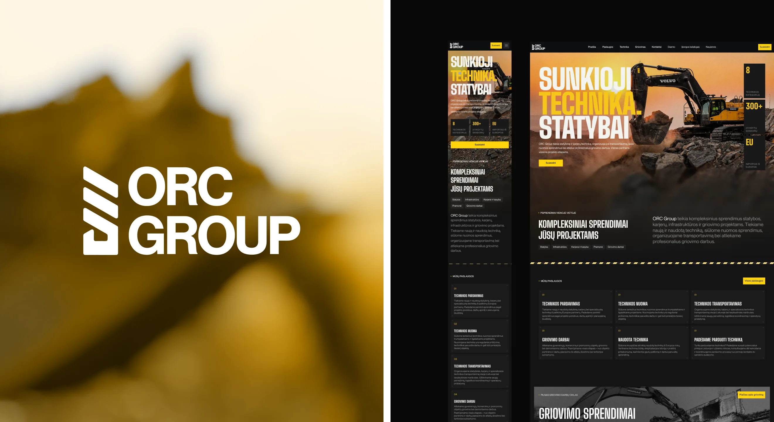
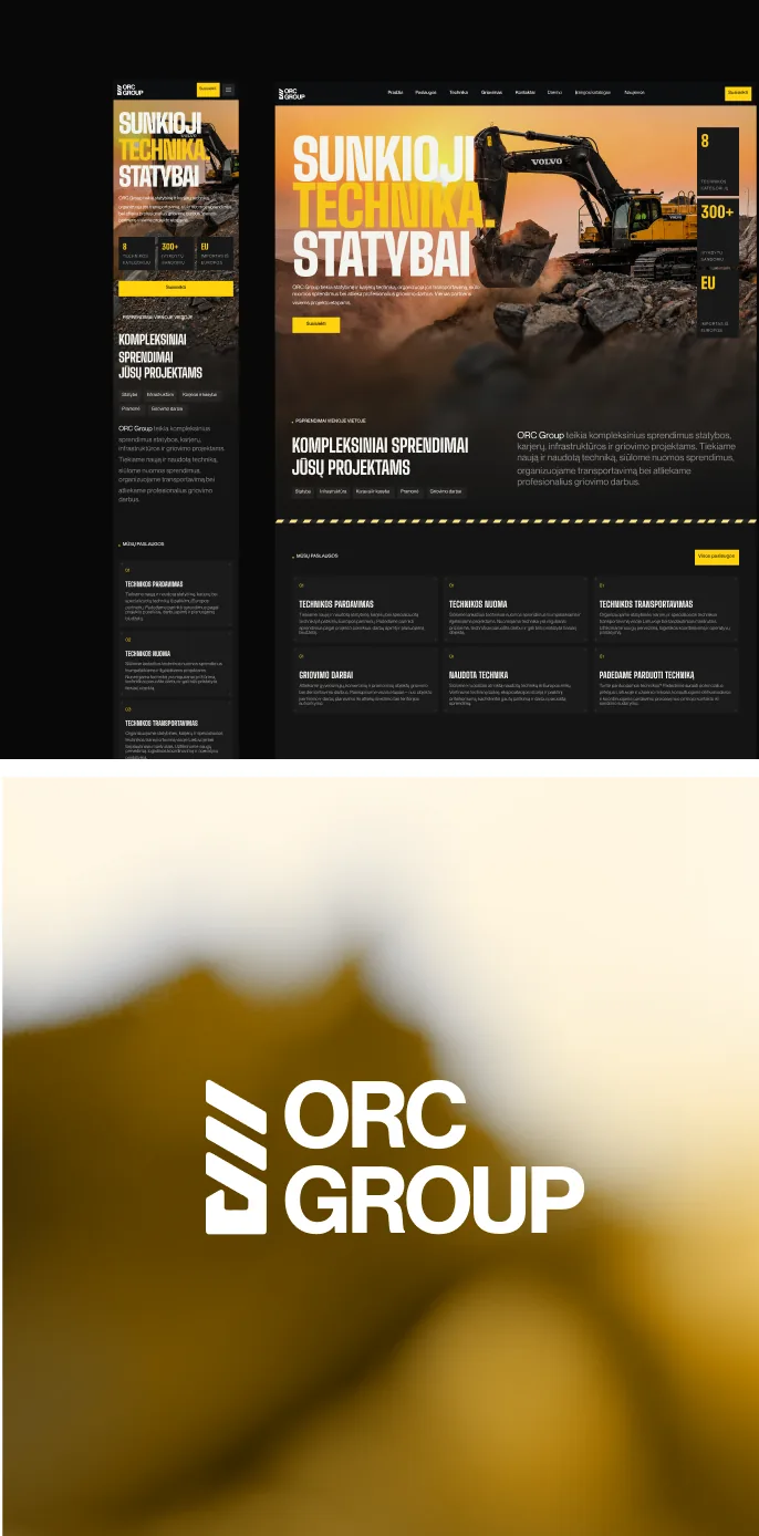
We built the brand around the industry itself — black-and-yellow, bold condensed type, real job-site photography instead of stock — and carried it through every part of the site. The homepage leads with the equipment itself and the numbers that matter to a buyer: categories carried, deals closed, EU-sourced import. From there, three paths split by intent — buy, rent, or hire for demolition — each with its own catalog and specs rather than one generic "products" page.
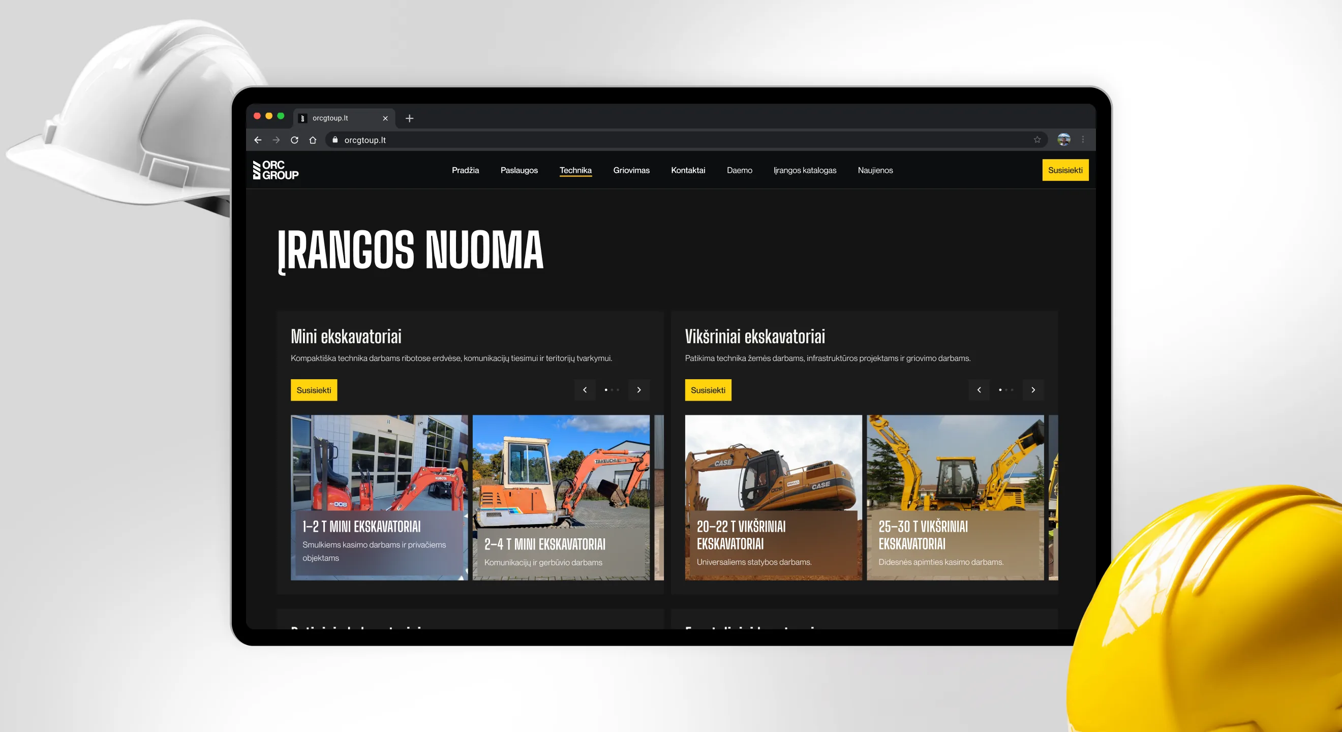
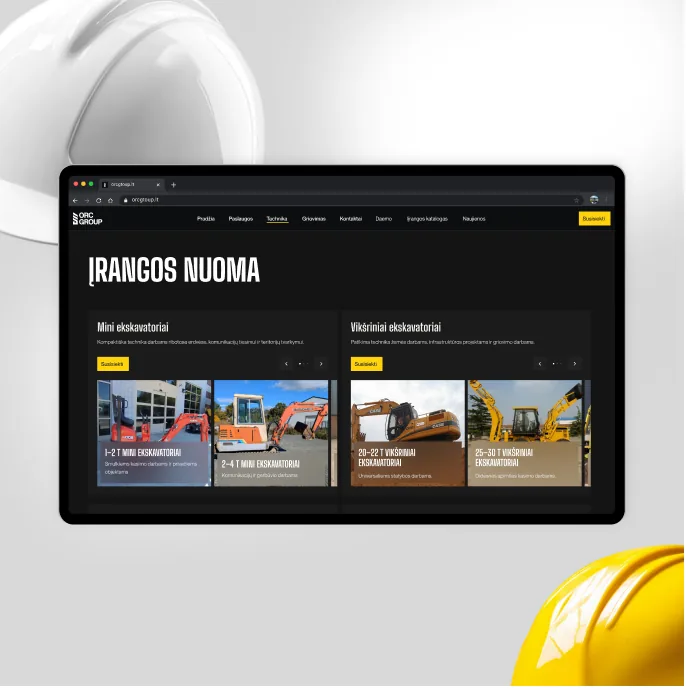
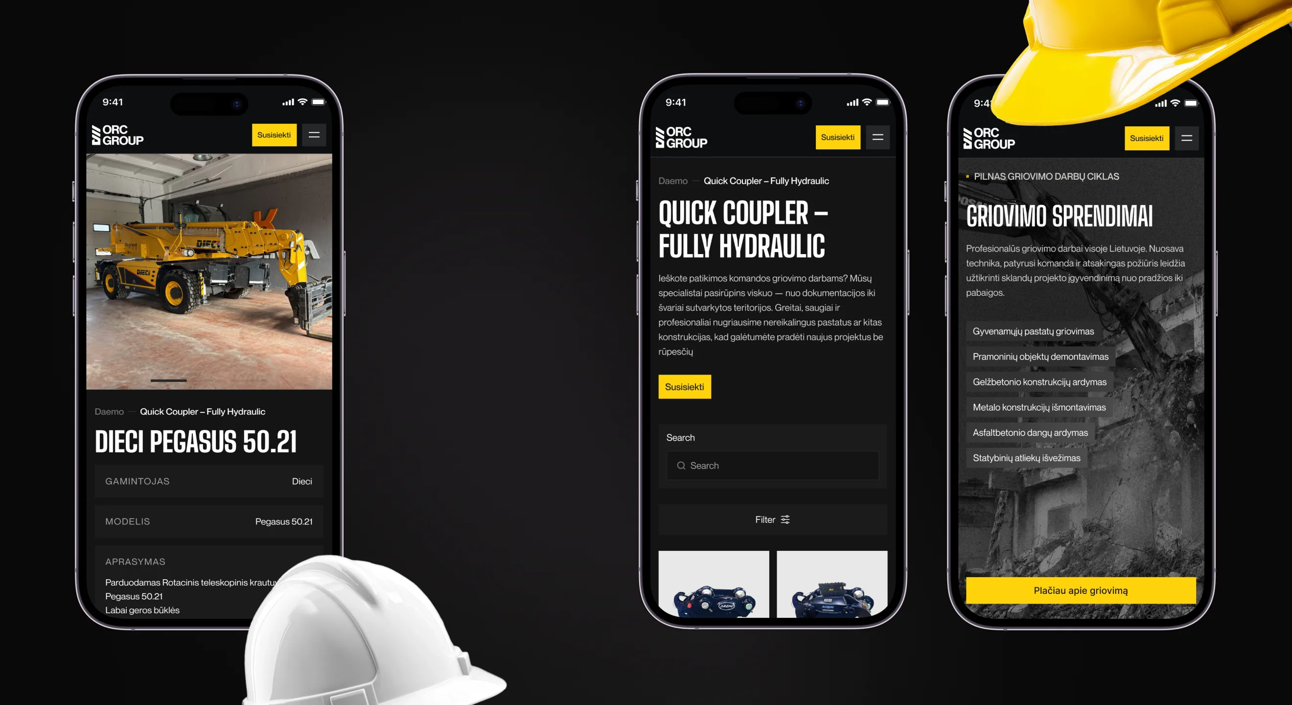
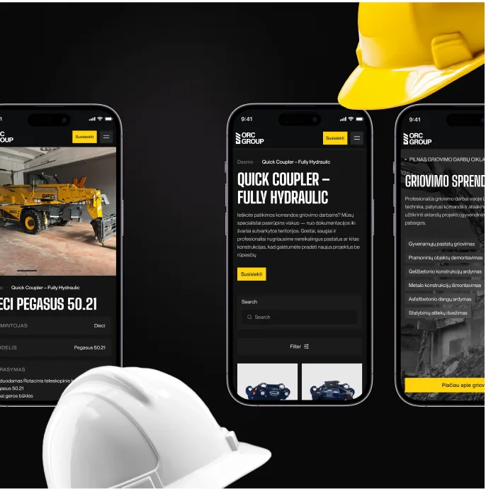
The brand identity came before a single page was built — a stacked, angular mark and a black-and-yellow system pulled straight from job-site signage and heavy equipment paint jobs, so the site would look native to a construction yard rather than a generic corporate template.
That same system had to hold up across three very different catalogs on one site — machines for sale, machines for rent, and demolition services — without any of them feeling like an afterthought bolted onto the others.
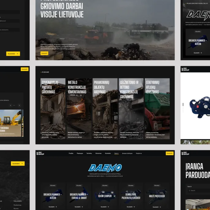
Every piece of equipment, whether a Daemo attachment or a rental excavator, gets the same product page — manufacturer, model, full spec table, and a price or a direct request-a-quote button — so a buyer doesn't have to call just to find out if a machine fits their carrier.
The demolition section works the same way as the equipment catalog: browse by job type — residential, industrial, structural, reinforced concrete — each with its own photo from an actual site, not an icon.
//websters
Our team are developers who are passionate about growing your business by bringing the designers’ awesome ideas to life. The QA-testers make sure the ideas are not fucked up, and the managers are managers.
instagram
Andrej C.
Founder


Tim G.
Manager


Alex H.
Frontend Developer


Nikita L.
CTO


Nikita K.
Backend Developer


Daniil K.
Designer


Valeria R.
Designer

Vladimir K.
Backend Developer


Denis B.
Mobile Developer


Zhenya N.
Backend Developer


Oxana C.
Frontend Developer

Yulia I.
Designer