brand identity, website design and development for white label
An affiliate traffic agency that explains itself with a switch, sticky notes and a chart
Subject
White Label is a TIER-1 agency that helps eCommerce brands grow from 7 to 8 figures with affiliate traffic: influencers, Twitch, YouTube, Pinterest, Snapchat and native ads. For most founders, affiliate marketing sounds complicated and a little shady. The brand and the website had to make it feel simple, honest and a bit fun.
What have we done
- Built the brand identity: a wordmark with a corner bracket, Soyuz Grotesk and Montserrat, a white, black, orange and blue palette and a sticker kit.
- Designed and developed the website with an animated hero for six traffic sources.
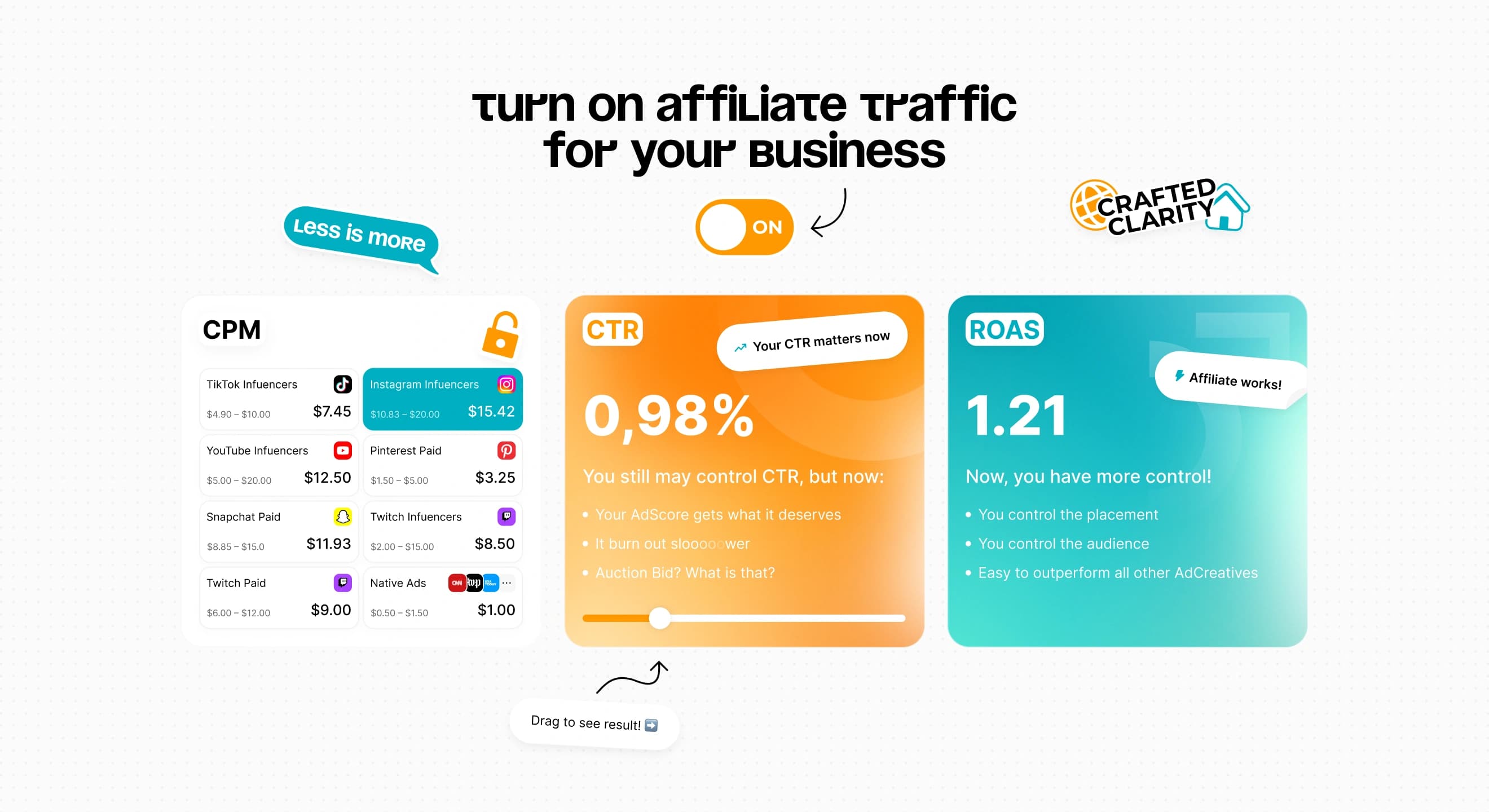
- Made an ON/OFF switch that reveals CPM, CTR and ROAS cards.
- Told the process through sticky notes and mapped every ad placement by channel.
- Designed a results slider, a blog with articles and case studies, Meta and Google pop-ups and a 404 page.
- Adapted every page for 768 and 375 and prepared social media avatars and covers.
Task
Explain affiliate traffic to eCommerce founders who already spend on Meta and Google, prove that it works and get them on a call. All without turning the site into a long read that nobody finishes.
Solution
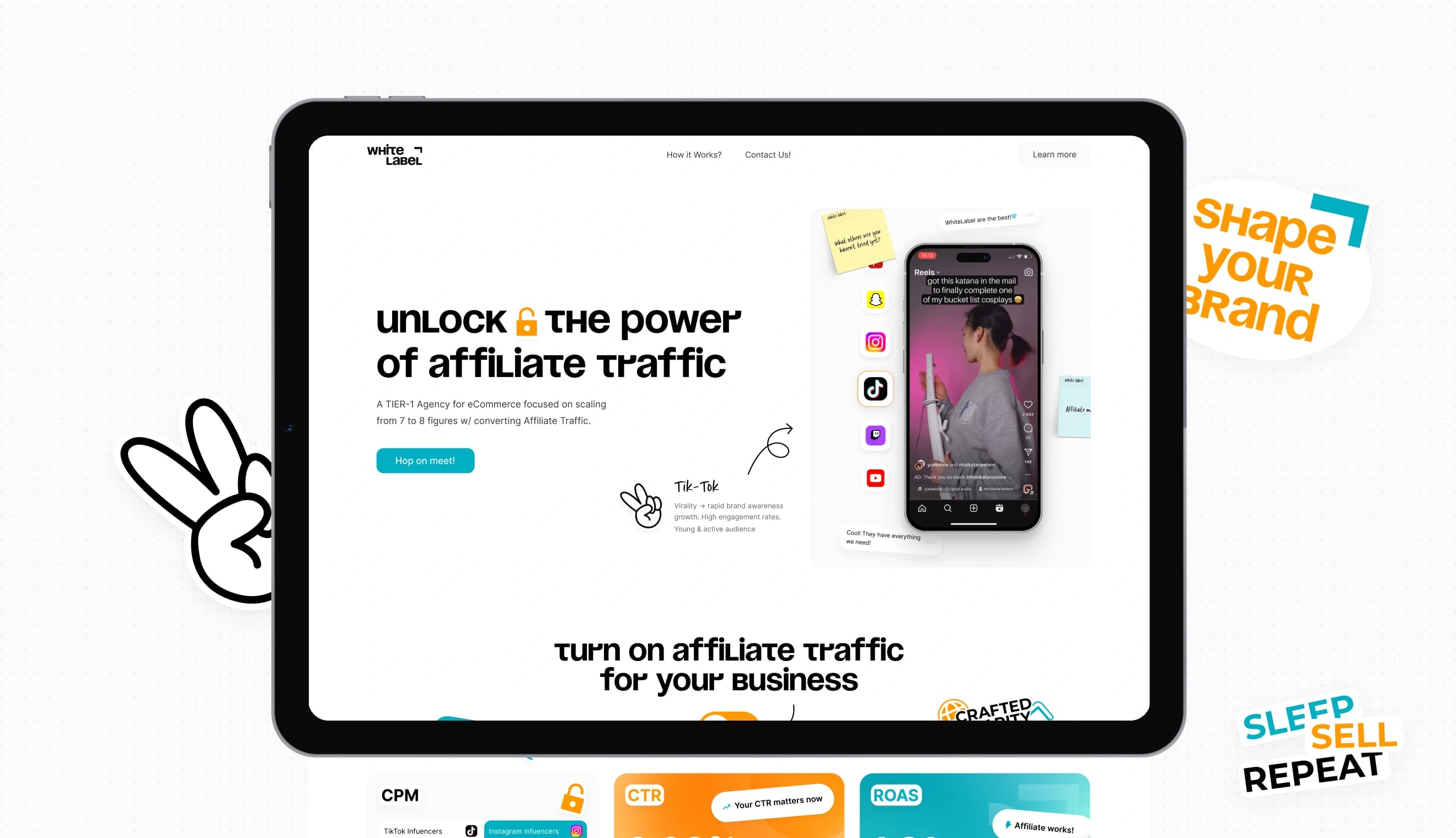
We built the page as a series of small “aha” moments. Flip a switch and the metrics change. Drag a slider and CTR goes up. Open a channel and see every ad format it offers. The brand is white by design, so orange and blue appear only where something can be pressed, dragged or switched on.
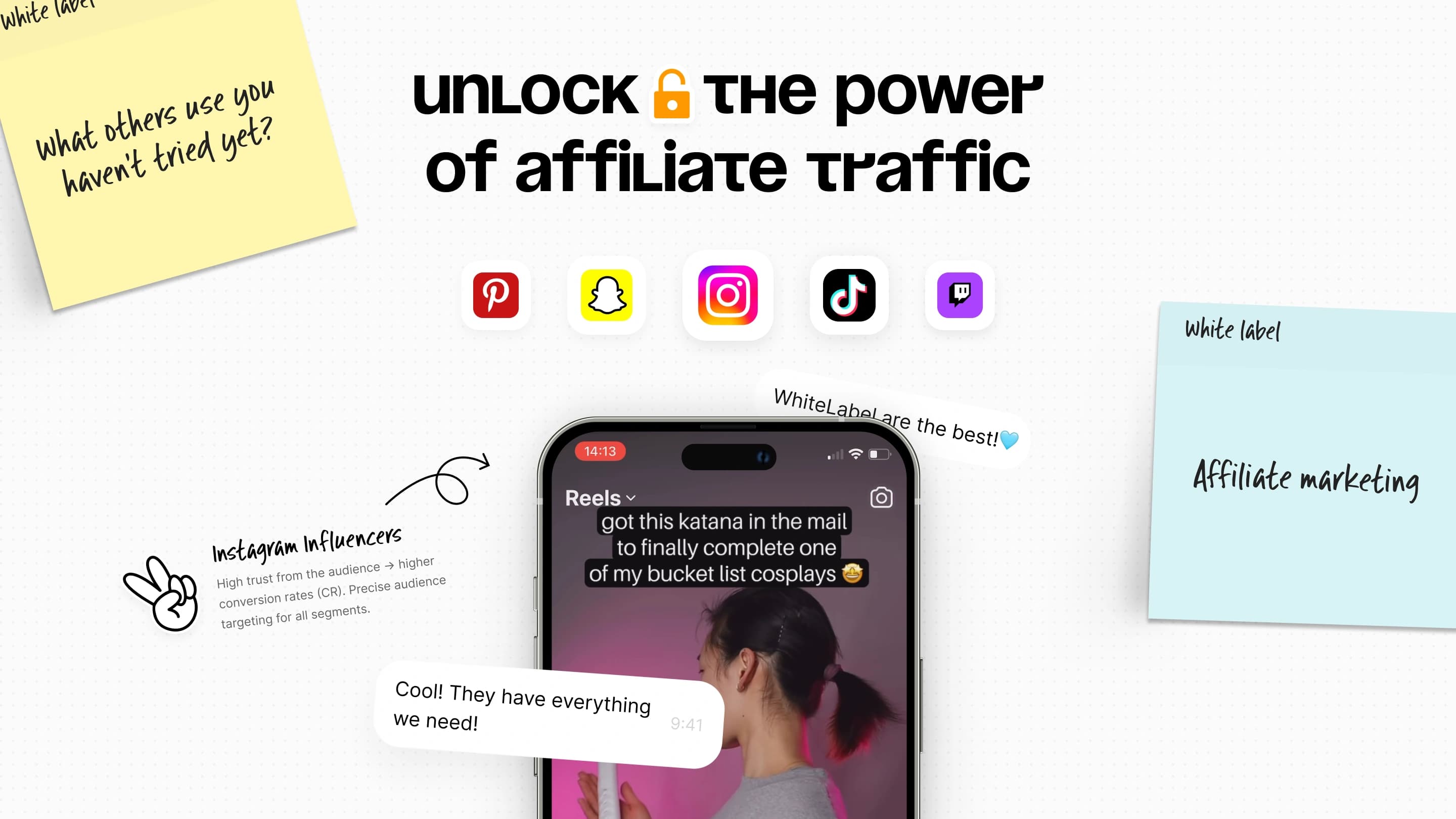
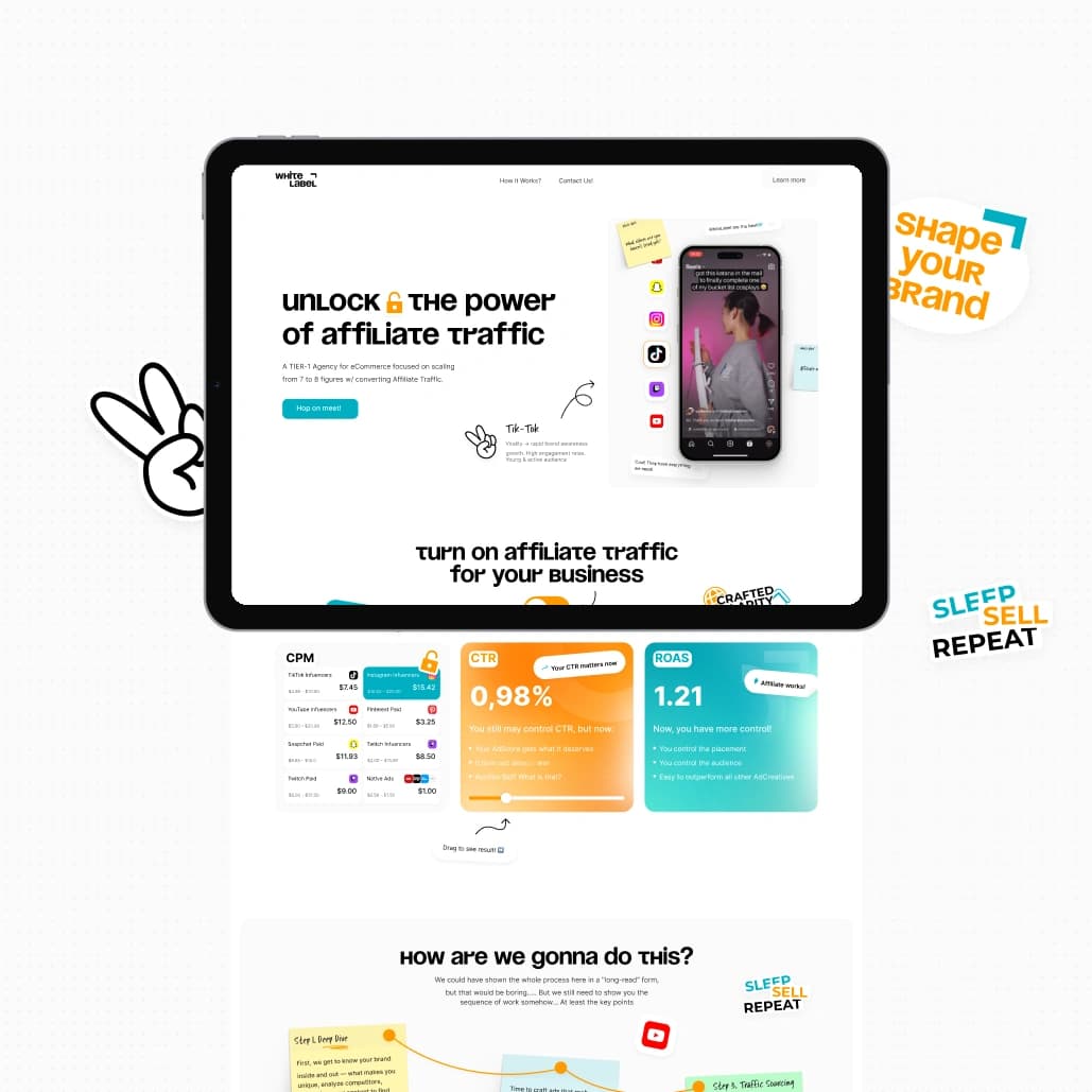
The hero shows the product rather than a promise. The phone plays content from TikTok, Instagram, Snapchat, Pinterest, YouTube and Twitch, the side rail switches sources, and a handwritten note explains what each one is good for.
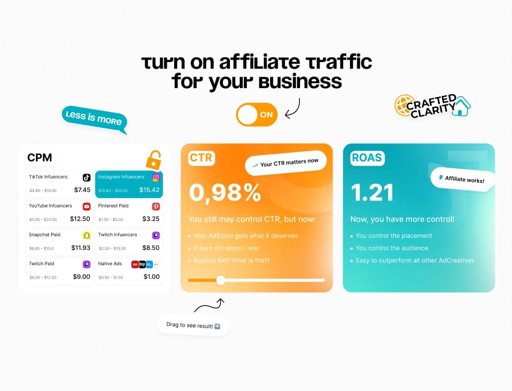
“Turn on affiliate traffic for your business” is a literal switch. Turn it on and the CPM table fills with prices for eight channels, CTR rises to 0.98% and ROAS reaches 1.21. Visitors get the argument in one click instead of three paragraphs.
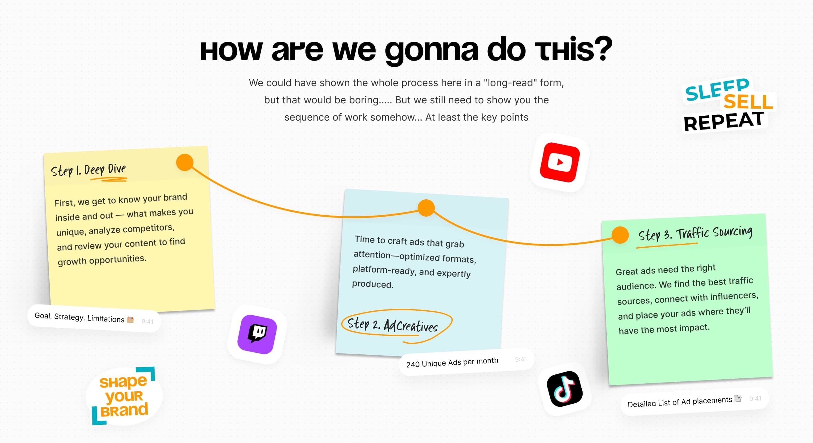
Instead of a long read about the workflow, the process is three sticky notes joined by a line: Deep Dive, AdCreatives and Traffic Sourcing. Each note carries a small attachment, like 240 unique ads per month, so every step feels tangible.
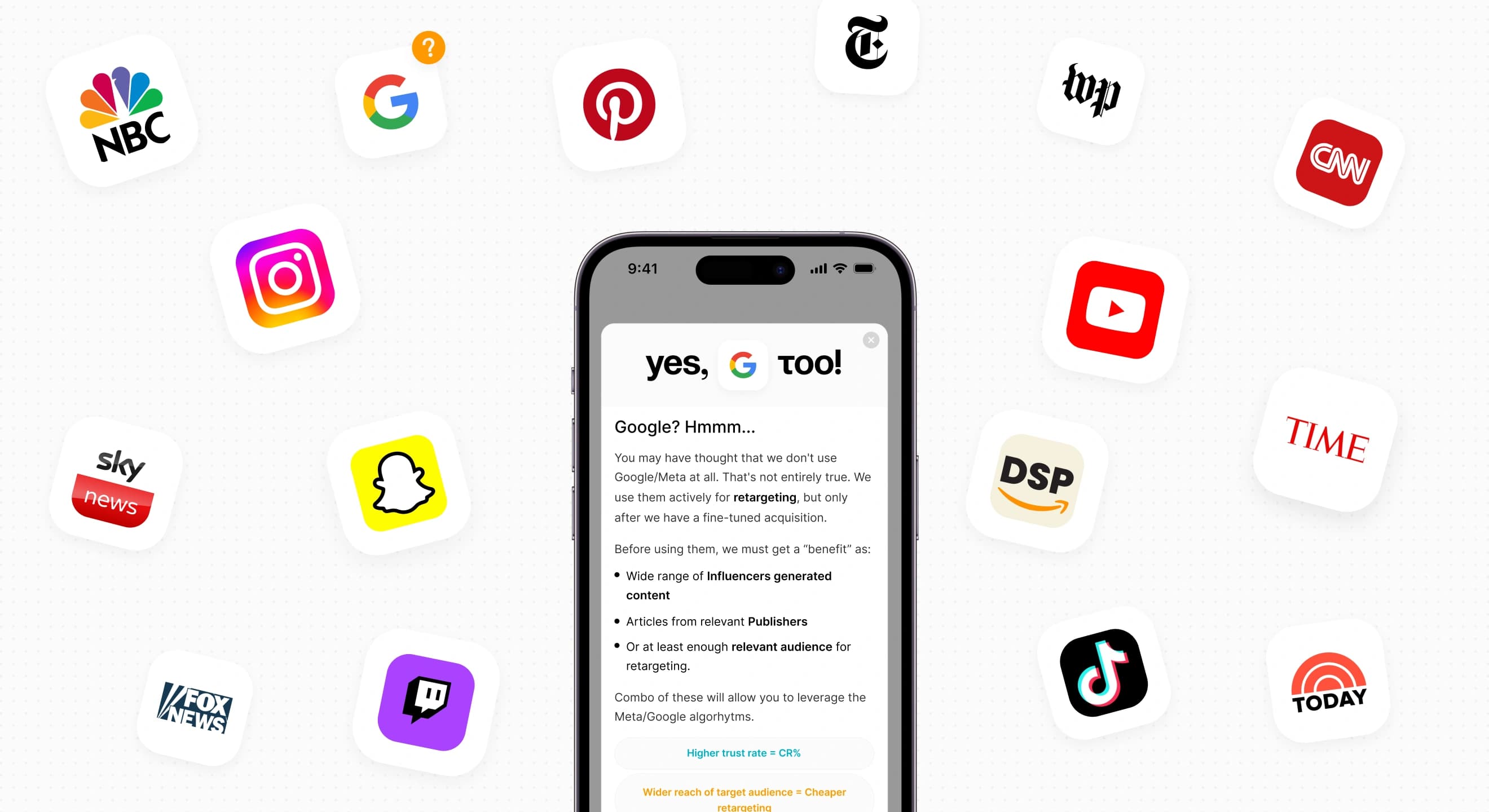
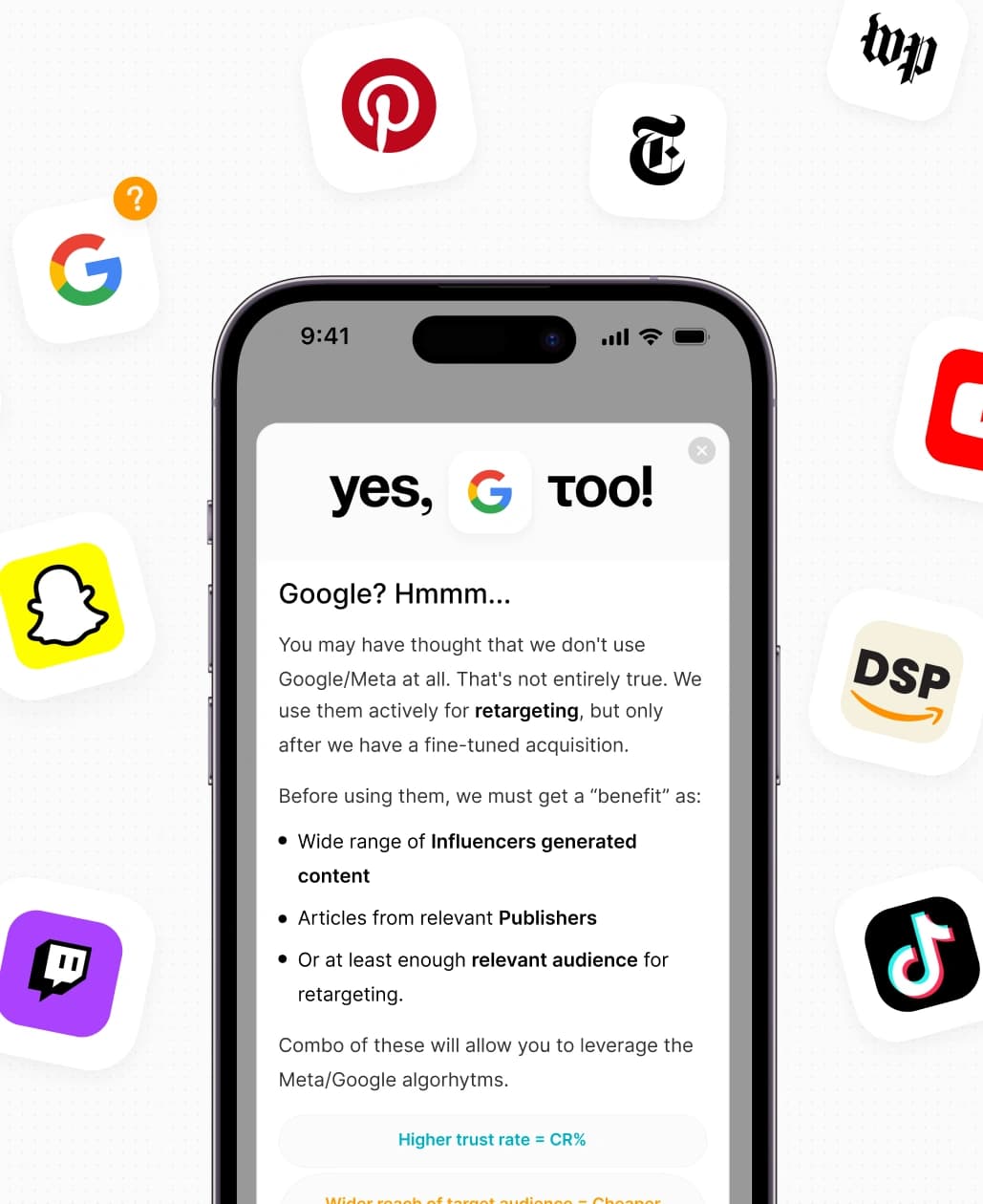
“We can advertise anywhere” is backed by a placement map. Each channel opens to show its real formats, from Twitch Homepage Headliners to YouTube Shorts ads and native in-feed units. Meta and Google get their own pop-ups: yes, White Label uses them too, for retargeting.
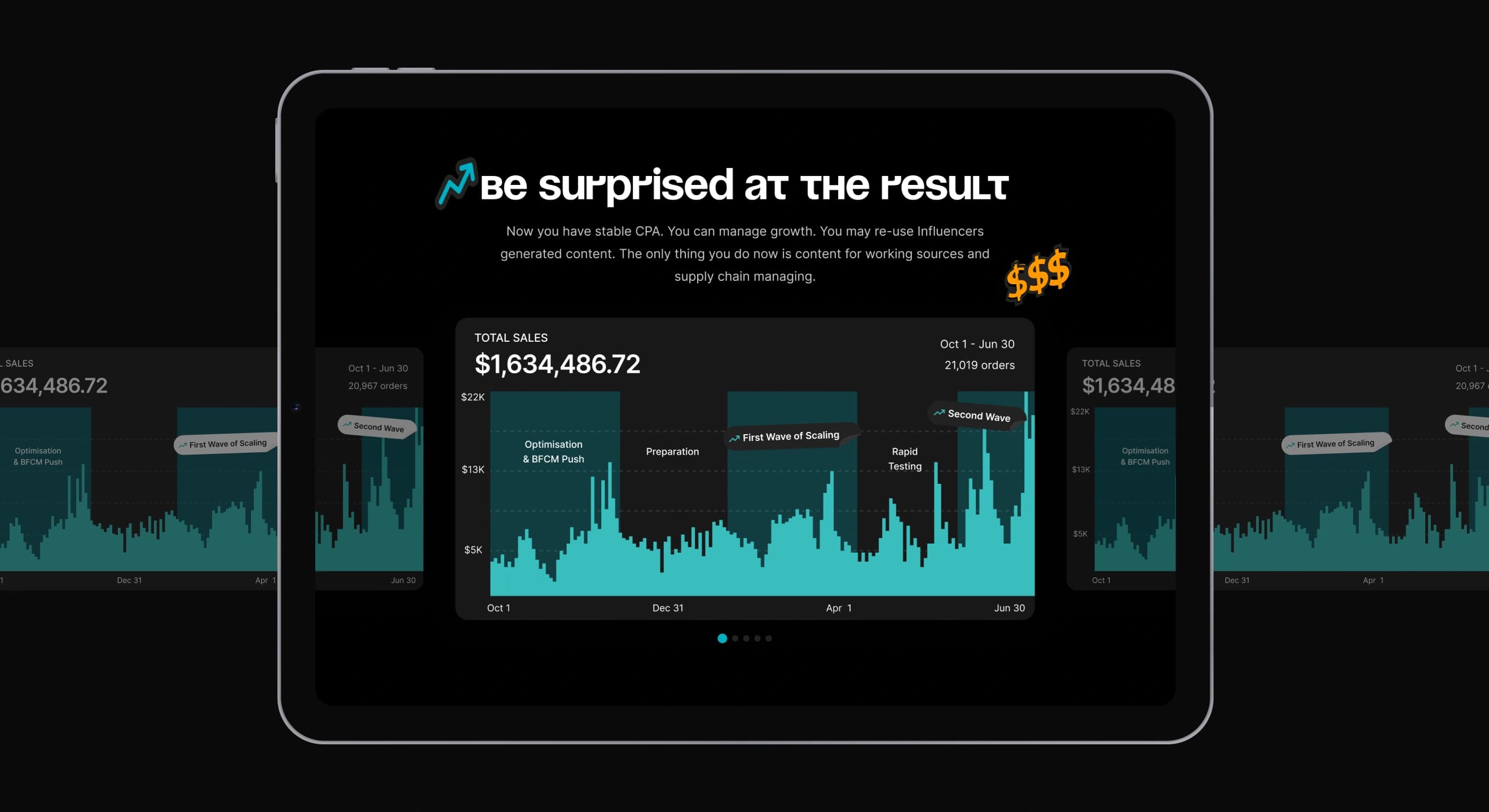
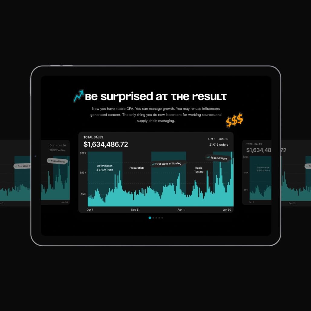
The page ends with numbers: $1.6M in total sales over nine months, split into preparation, rapid testing and two waves of scaling. The slider lets the agency add new case charts without redesigning the section.
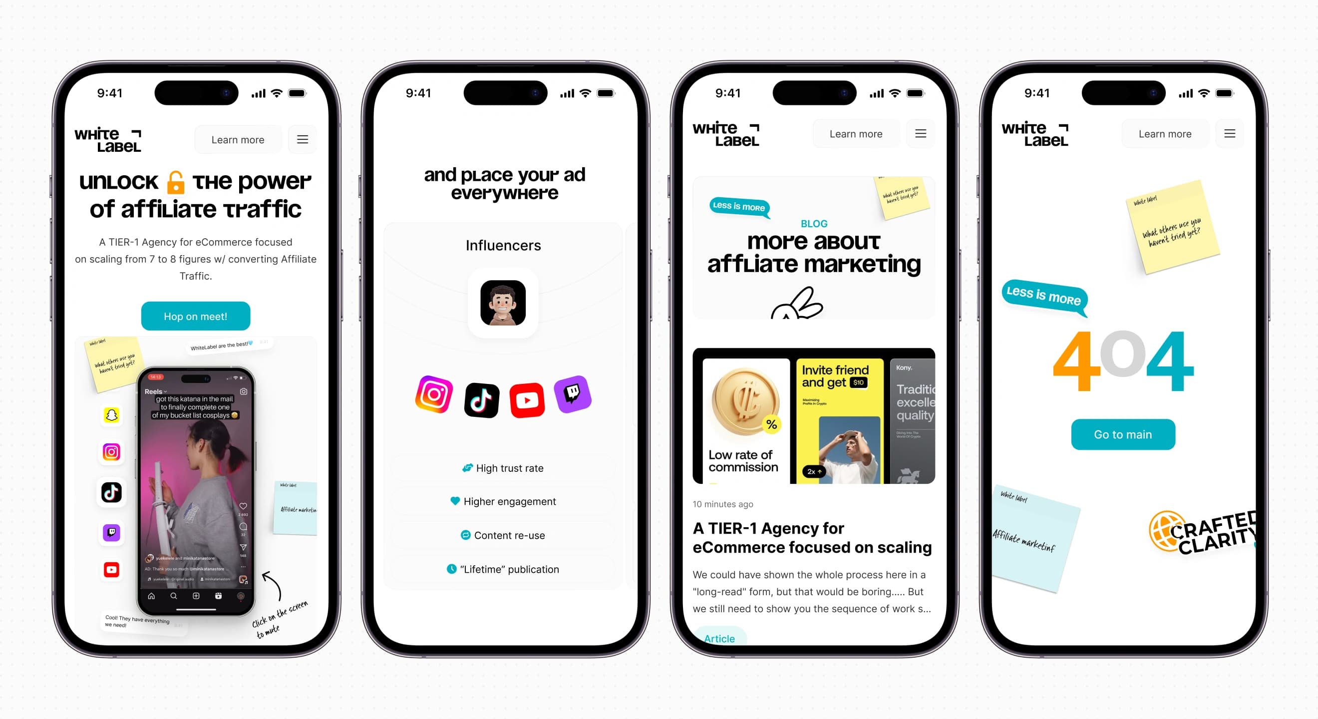
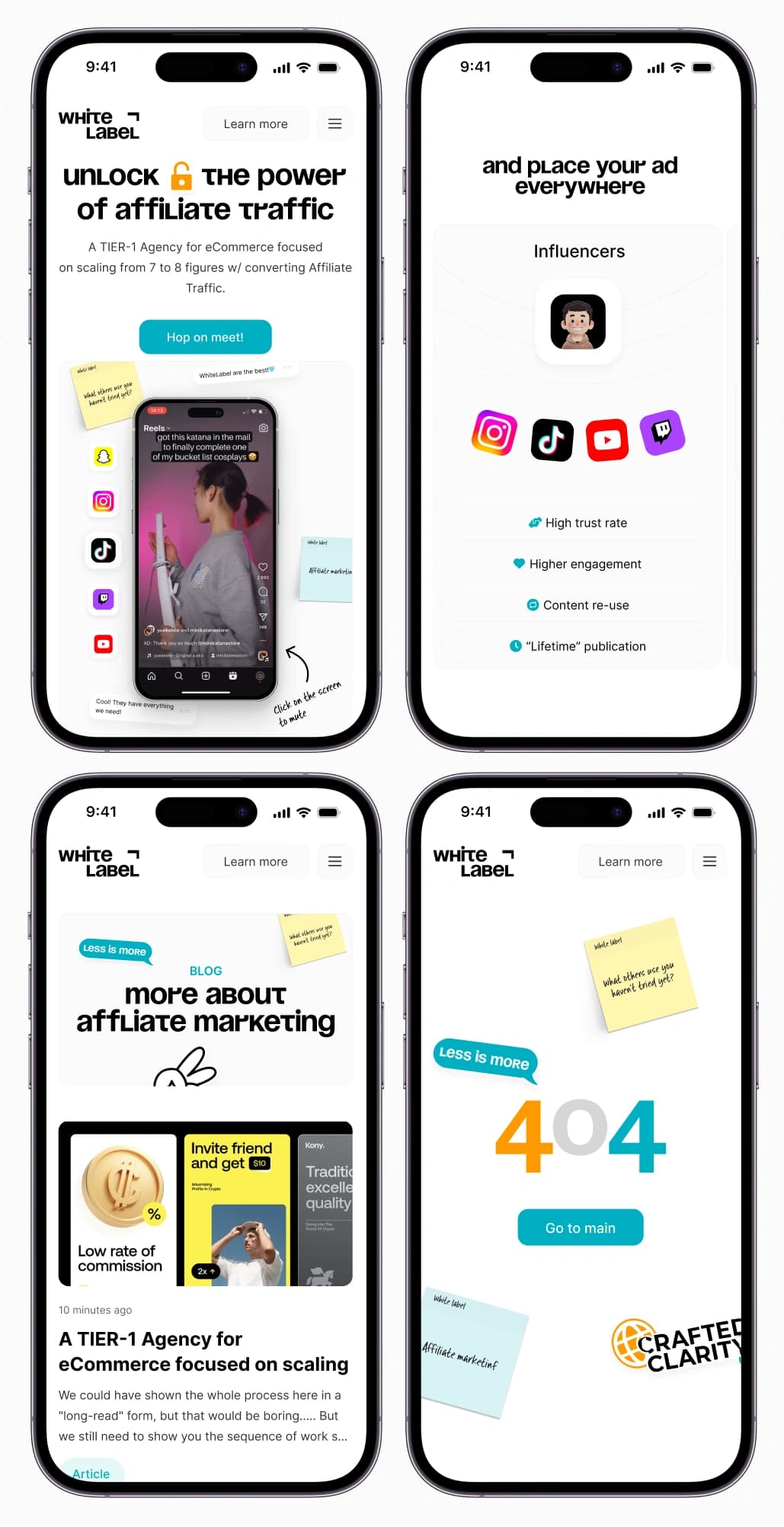
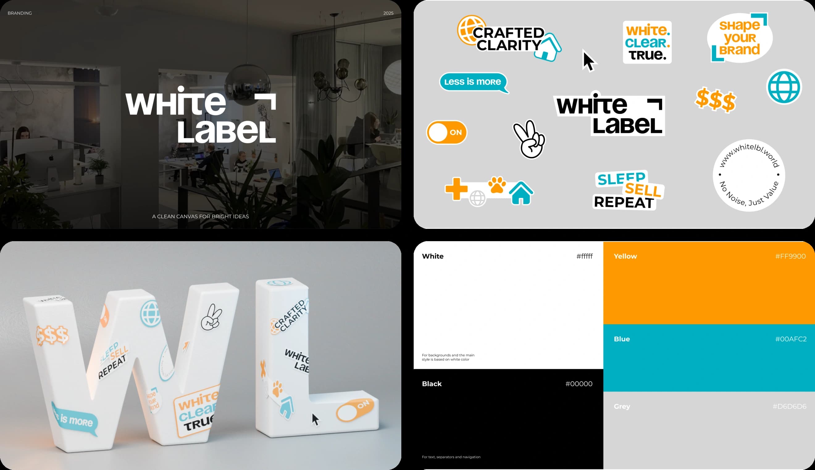
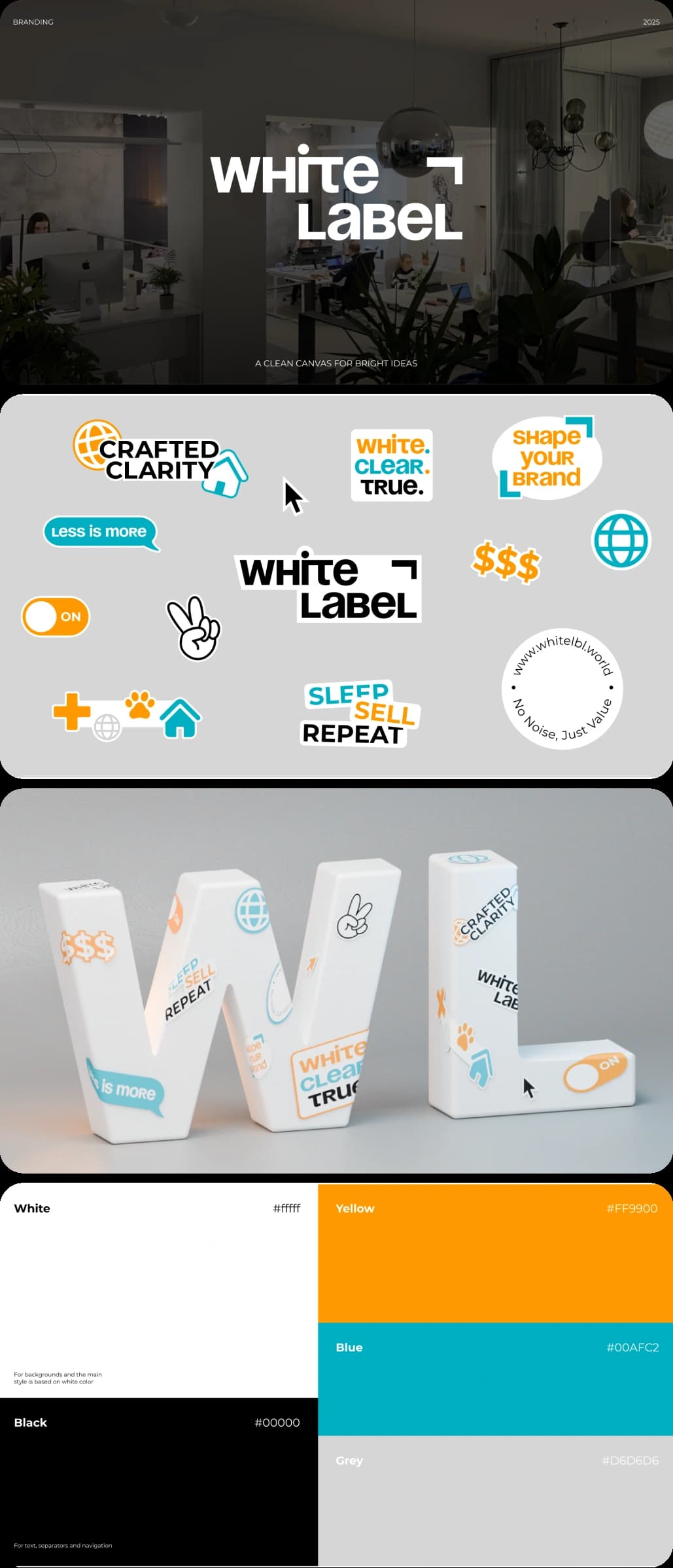
On mobile the sticky notes stack, the placement map becomes a list and the menu turns into a full-screen sheet with one call to action. The identity runs on contrast: a black wordmark on clean white, plus stickers like “Less is more” and “Sleep. Sell. Repeat” that make serious marketing feel human. The same kit covers social media and a 3D logo for presentations.
//websters
Our team are developers who are passionate about growing your business by bringing the designers’ awesome ideas to life. The QA-testers make sure the ideas are not fucked up, and the managers are managers.
instagram
Andrej C.
Founder


Tim G.
Manager


Alex H.
Frontend Developer


Nikita L.
CTO


Nikita K.
Backend Developer


Daniil K.
Designer


Valeria R.
Designer


Vladimir K.
Backend Developer


Denis B.
Mobile Developer


Zhenya N.
Backend Developer


Oxana C.
Frontend Developer


Yulia I.
Designer