corporate website for south point lending
Website for a Miami private credit lender that looks as solid as its deals
Subject
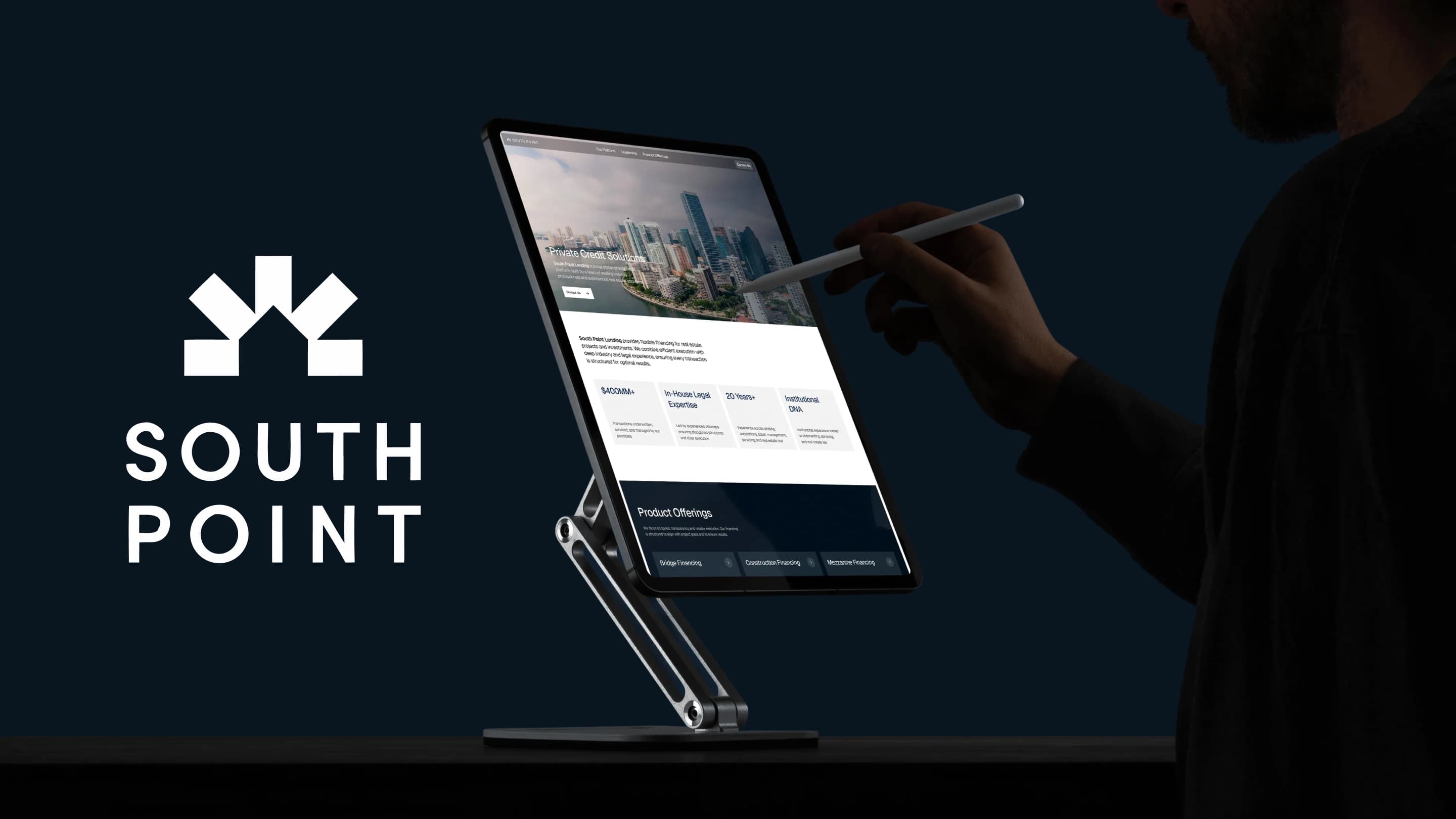
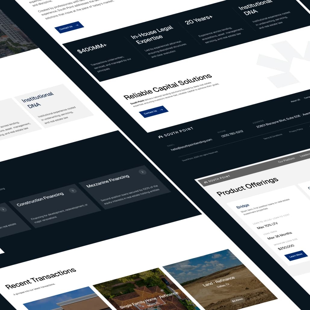
South Point Lending is a private credit platform from Miami, founded by lending professionals and real estate attorneys. It finances bridge, construction and mezzanine deals for investors, developers and property owners. We designed a corporate website that explains what South Point does, shows the terms up front and gets serious borrowers to the right person fast.
What have we done
- Studied how borrowers compare private lenders and built the page structure around those questions.
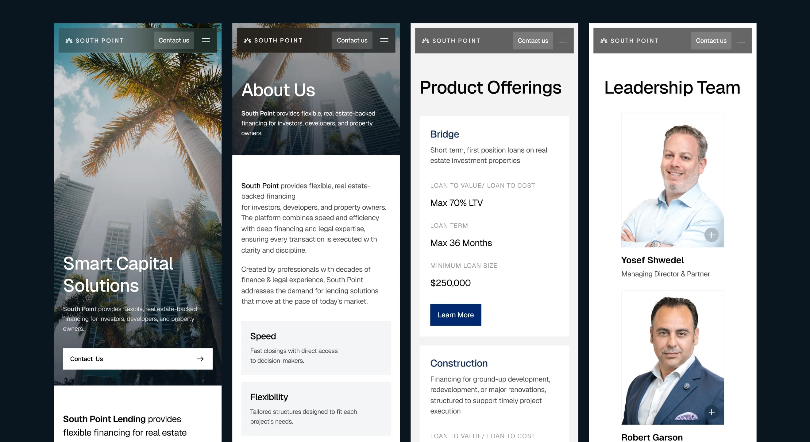
- Designed five pages: home, about, product offerings, leadership and contact.
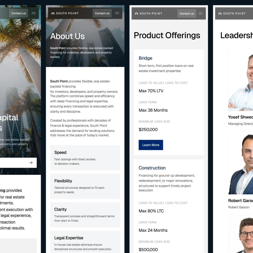
- Turned three loan products into comparable cards with loan-to-value, term and minimum loan size.
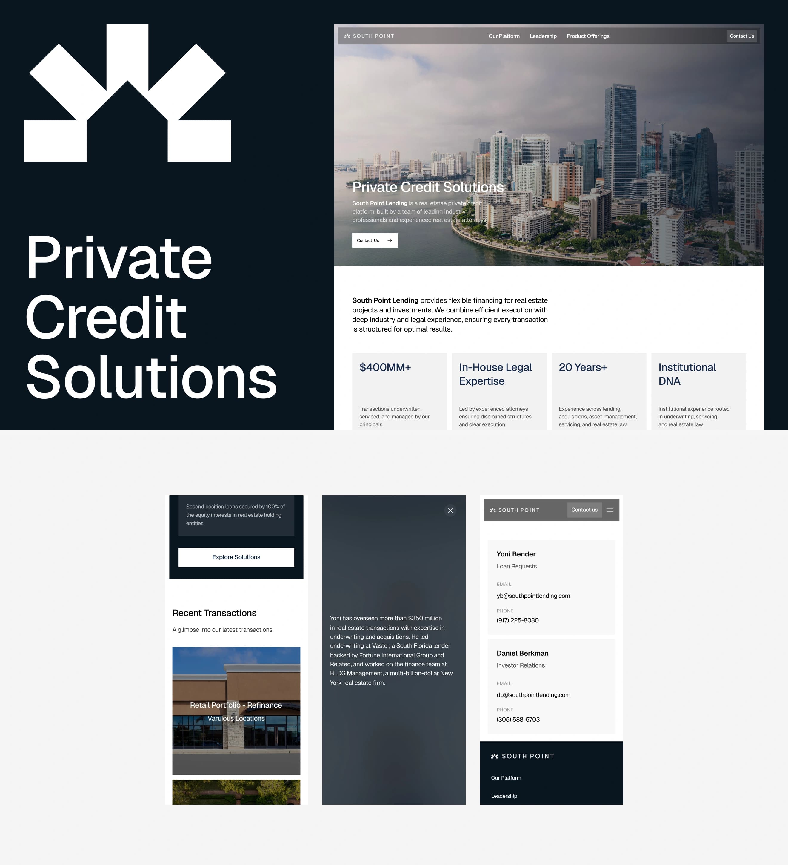
- Designed a recent transactions block with deal type, location and size.
- Made a leadership section where each partner's card opens to show their background.
- Built a contact page that sends loan requests and investor questions to the right person.
- Designed the mobile version, a component kit, an OG image and a favicon based on the South Point mark.
Task
Private credit runs on trust. A developer looking for a bridge loan compares several lenders at once and wants to know three things quickly: what they lend on, on what terms, and who they will actually be dealing with. South Point had the track record, with $400MM+ in transactions and 20 years in lending and real estate law, but no website that showed it.
Solution
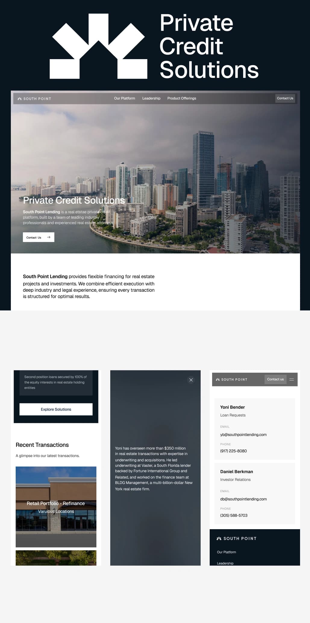
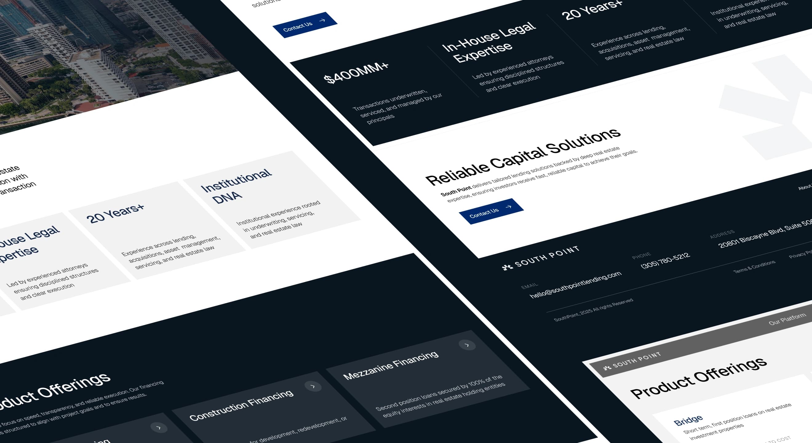
We kept the design quiet and institutional: deep navy, generous white space, one strong blue for actions and real photography of Miami. The home page says what South Point is, backs it up with four proof points and goes straight to products and recent deals. Every page ends with the same short call to action, so a borrower is never more than one click away from a conversation.
Loan terms are usually hidden until the first call. Here each product card lists the maximum LTV or LTC, the loan term and the minimum loan size side by side, so a borrower can tell in seconds whether their deal fits.
On mobile, the site keeps the same order and the same proof points. Navigation folds into a full-screen menu with a fixed contact button, because many first enquiries come from a phone between site visits.
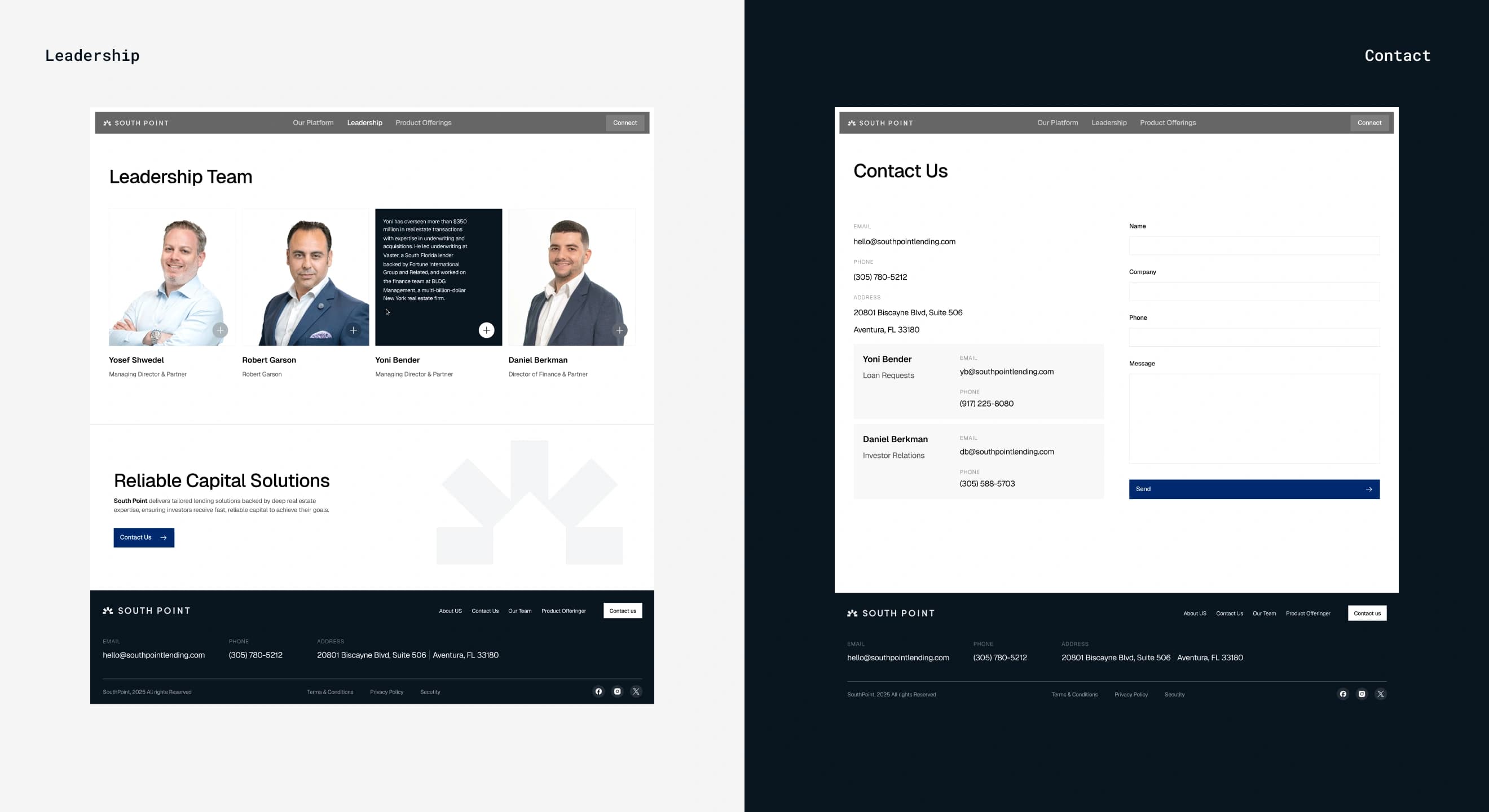
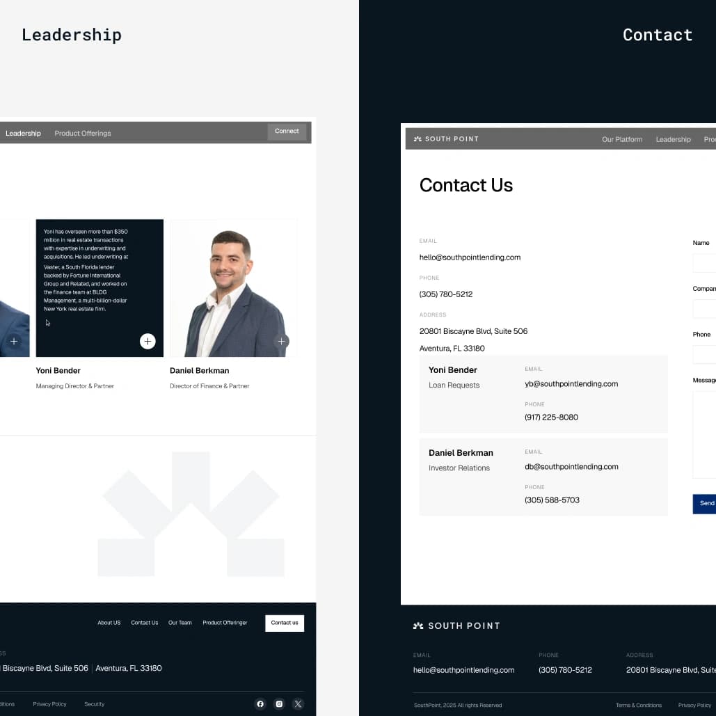
In private lending, people work with people. The leadership page puts faces and track records first, and the contact page names who handles loan requests and who handles investor relations, with direct emails and phone numbers.
//websters
Our team are developers who are passionate about growing your business by bringing the designers’ awesome ideas to life. The QA-testers make sure the ideas are not fucked up, and the managers are managers.
instagram
Andrej C.
Founder


Tim G.
Manager


Alex H.
Frontend Developer


Nikita L.
CTO


Nikita K.
Backend Developer


Daniil K.
Designer


Valeria R.
Designer


Vladimir K.
Backend Developer


Denis B.
Mobile Developer


Zhenya N.
Backend Developer


Oxana C.
Frontend Developer


Yulia I.
Designer