ios app design for pomodoro timer
A focus timer that feels calm, looks like a tomato and sells itself on the App Store
Subject
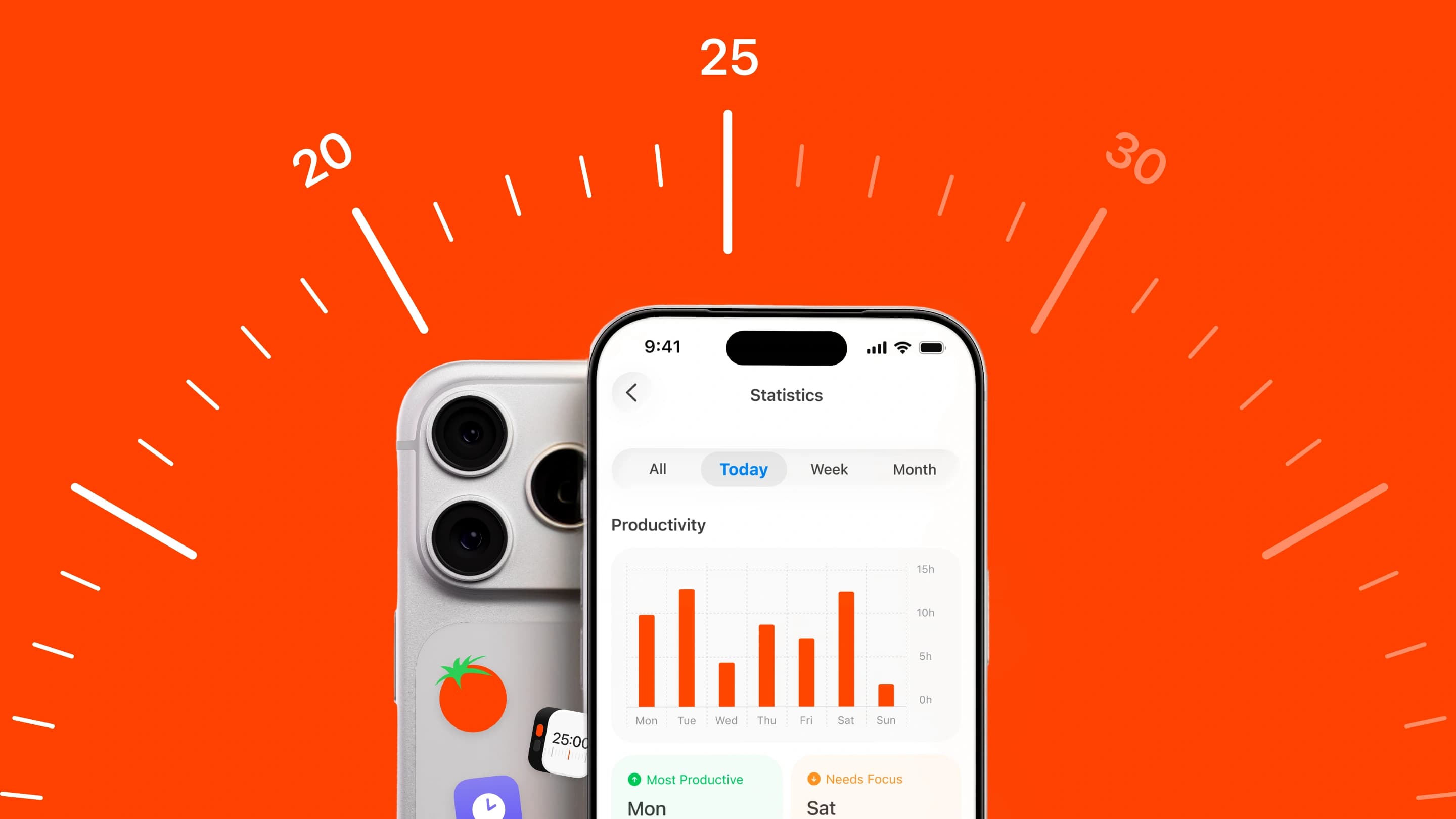
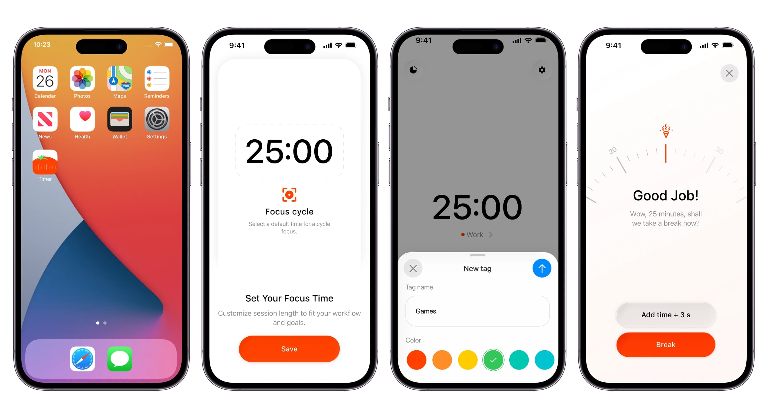
Pomodoro Timer is an iOS app built around the classic technique: 25 minutes of focus, then a short break. The market is crowded with timers that look like spreadsheets or toys. We designed the whole product experience: the timer itself, tags, statistics, settings, onboarding with a paywall, Home Screen widgets, Live Activities, the app icon and App Store screenshots in ten languages.
What have we done
- Designed the core timer with a physical-feeling dial you scroll to set the time.
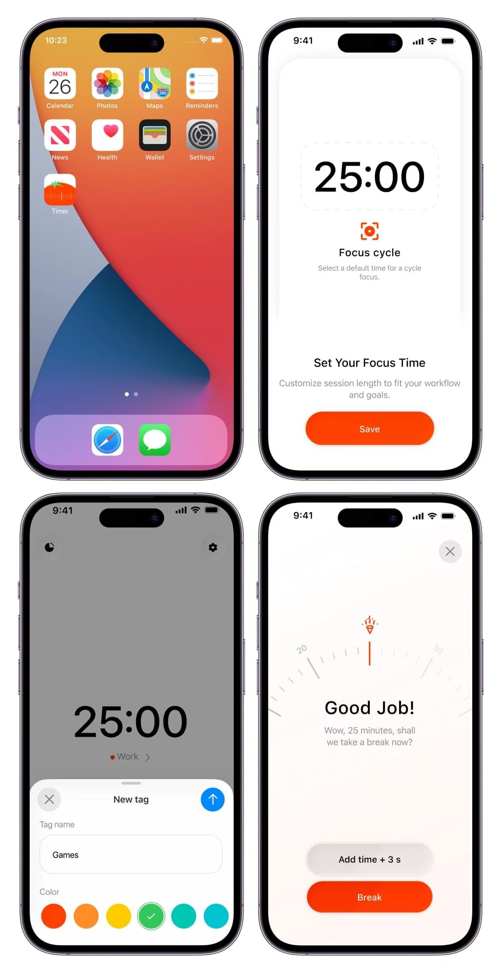
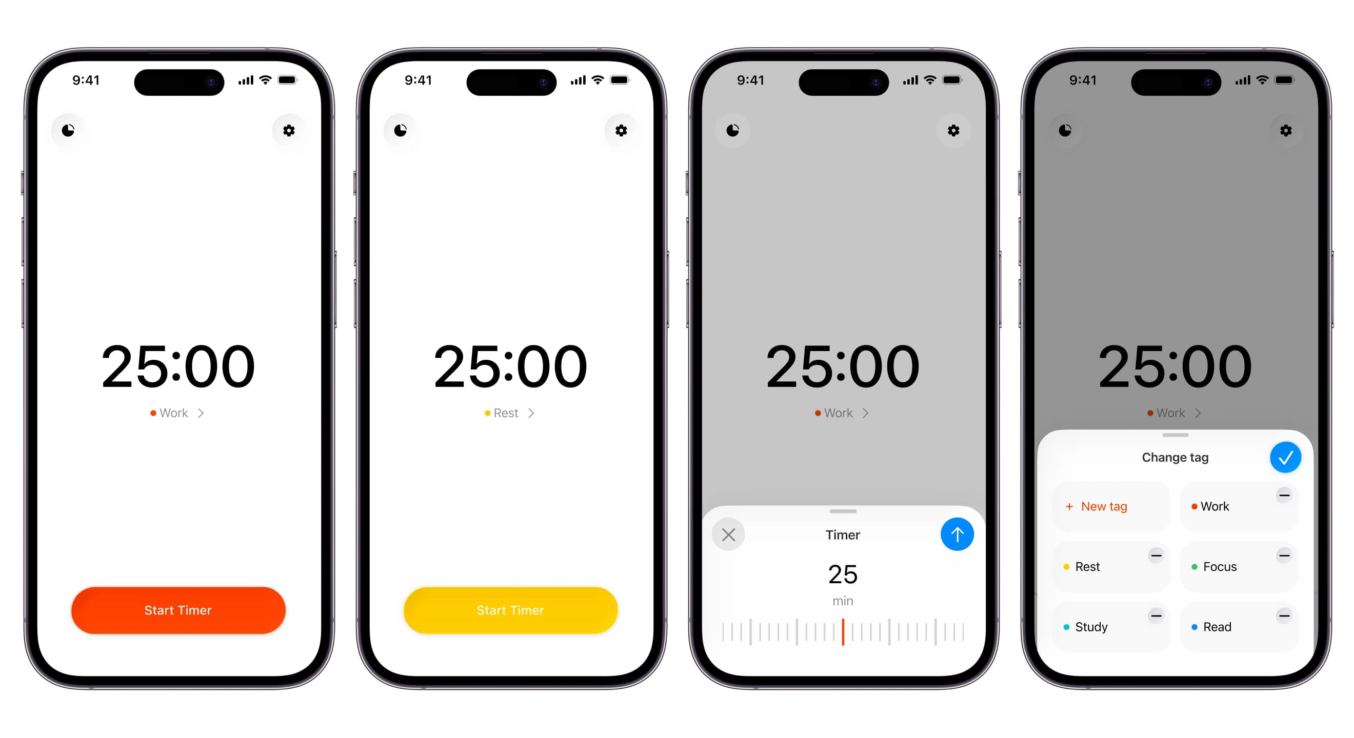
- Built colour tags for work, study, reading and anything else, with a quick switcher on the main screen.
- Designed statistics by day, week and month, with streaks, best and weakest days and time by tag.
- Designed onboarding that sells the habit, not the app, followed by a paywall in two styles.
- Made a full dark theme for every screen.
- Designed Home Screen widgets and Live Activities for the Lock Screen and Dynamic Island.
- Created nine app icon concepts and App Store screenshots in ten languages.
Task
A timer is the simplest app there is, so it has to win on feel. The client needed an app people open dozens of times a day without friction, one that turns focus sessions into a visible habit and makes a subscription feel worth it.
Solution
We kept the main screen almost empty: a big 25:00, the current tag and one button. Setting the time works like turning a kitchen timer, with a ruler that clicks under your thumb. The tomato orange is used sparingly, for the active state, the end-of-session moment and the button that matters, so the app stays calm while you work.
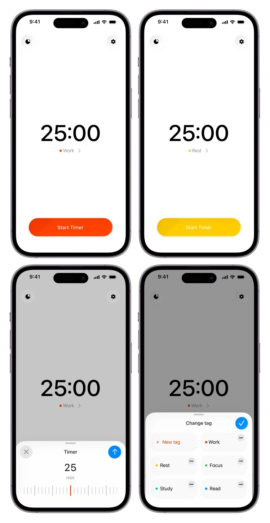
A session has a clear rhythm. Start, focus, a quiet “Good job!” with the dial behind it, then a break in a softer colour. Holding to stop prevents accidental resets, which is the most common complaint about timer apps.
Tags turn sessions into data. Statistics show total focus time, sessions and streaks, highlight the most productive day and the one that needs attention, and break time down by tag.
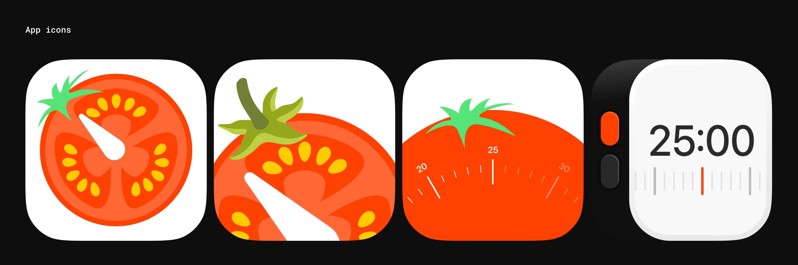
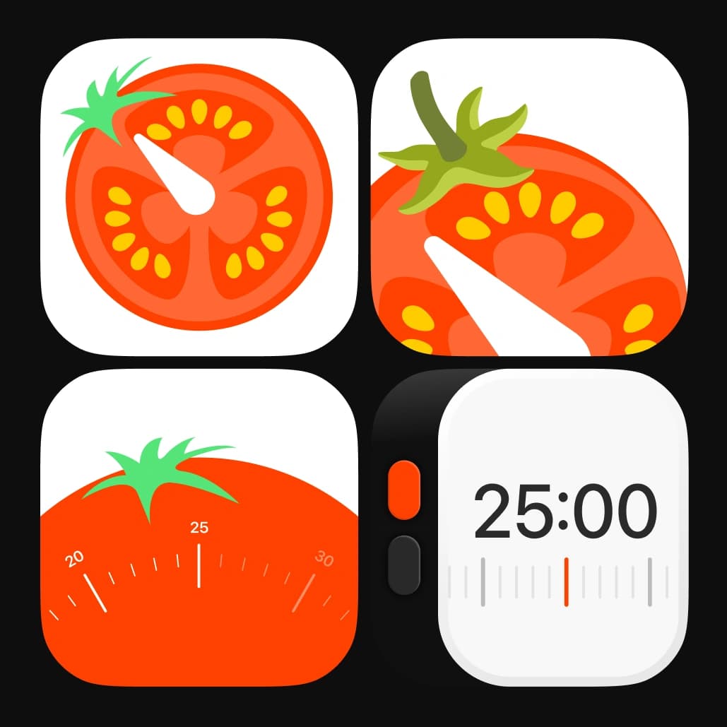
The icon had to stand out on a crowded Home Screen. We explored nine directions, from a sliced tomato to a minimal 25:00 dial, keeping the shape readable at the smallest size.
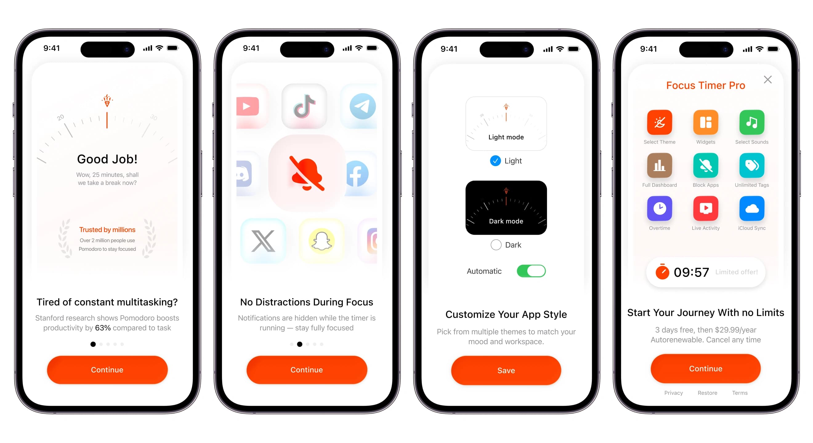
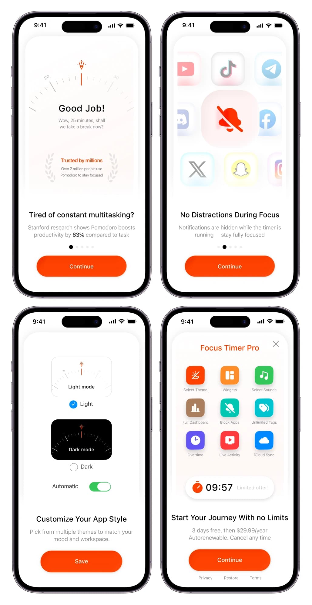
Onboarding starts with the problem, constant multitasking, and only then introduces features: blocking distractions, statistics and themes. The paywall follows as the natural last step, with a clear lifetime option alongside the subscription.
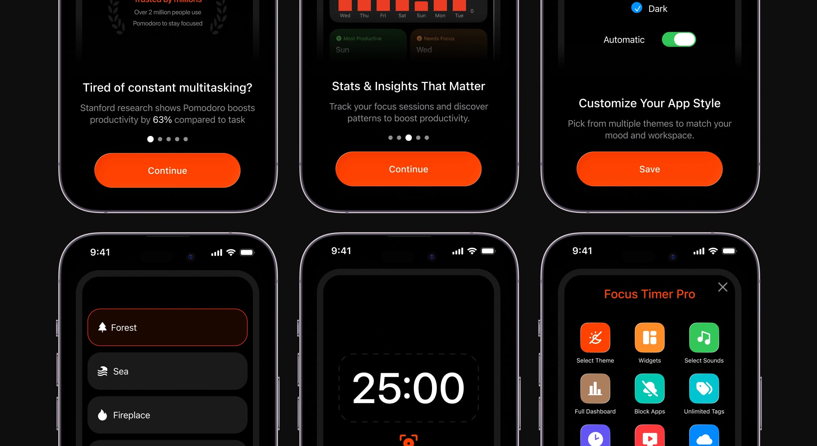
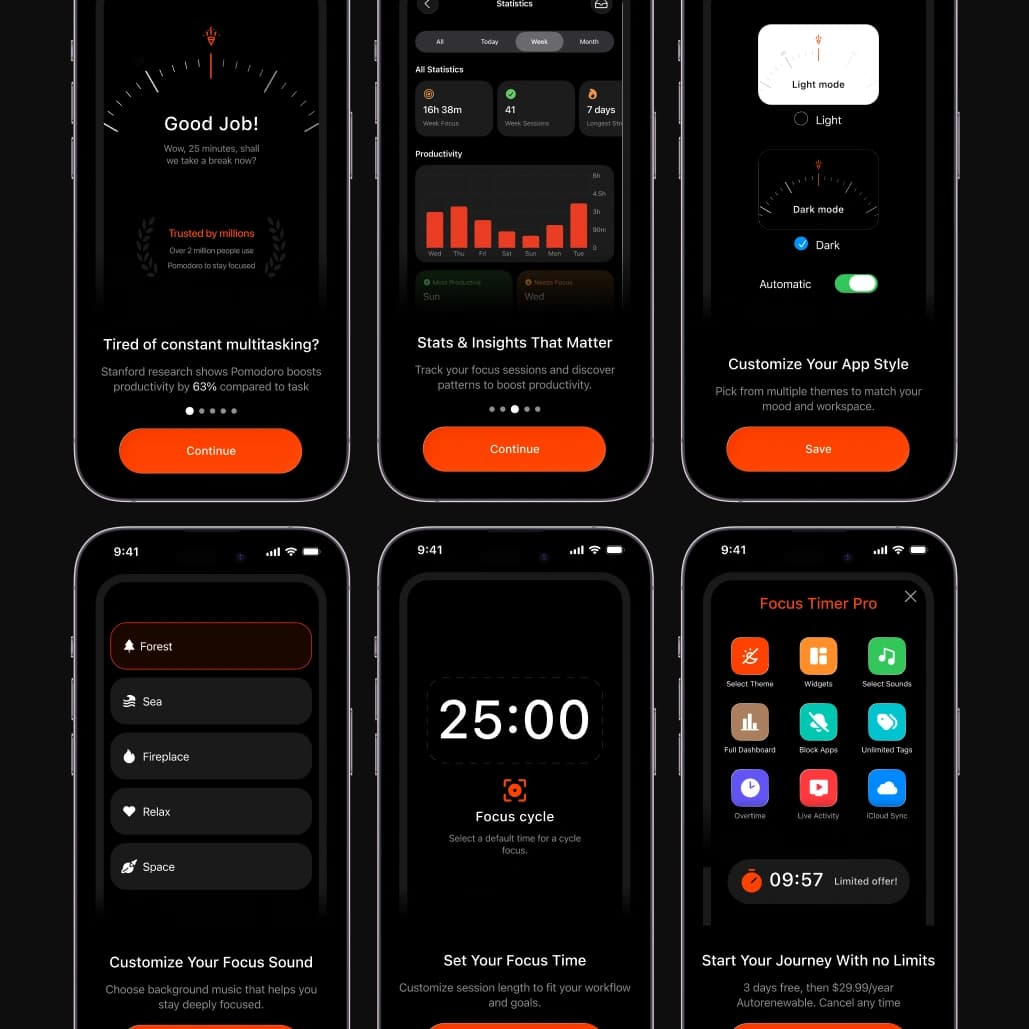
Dark mode isn't an inverted copy. The orange glows a little brighter and the dial becomes the main light source, which makes the app comfortable for late sessions.
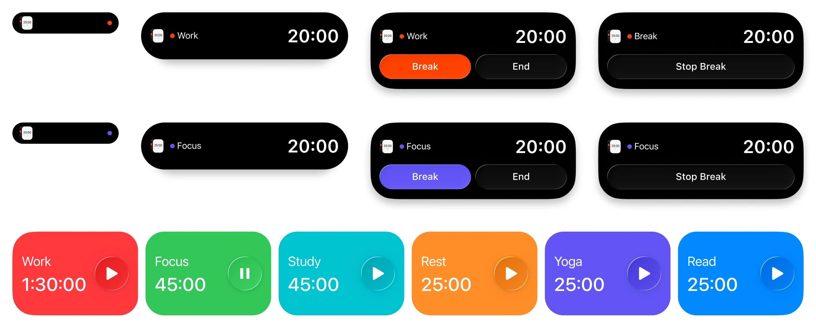
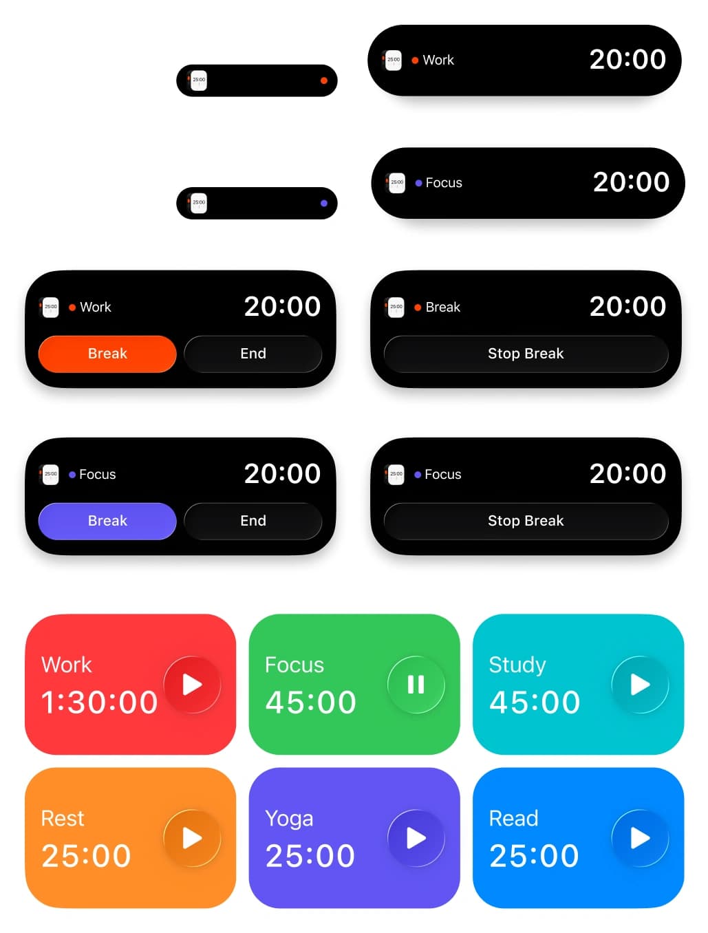
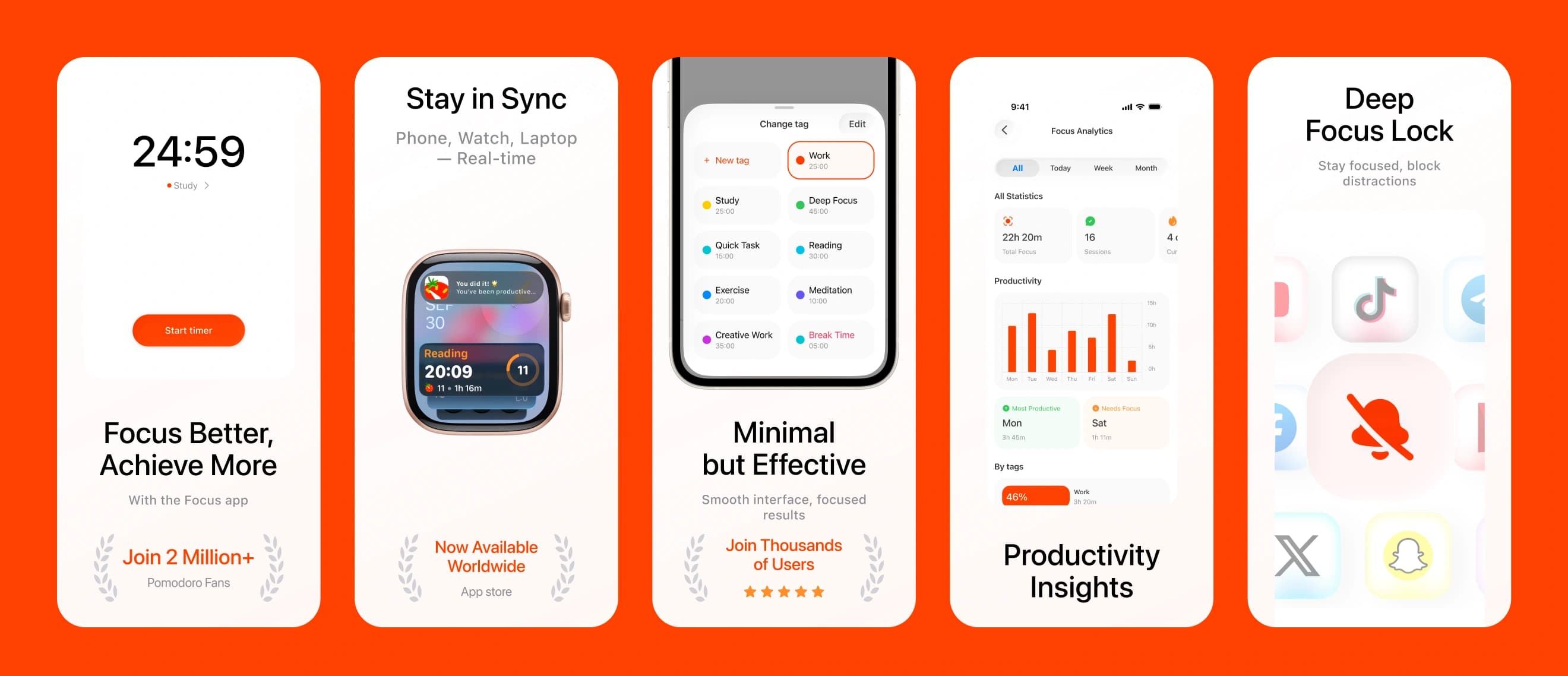
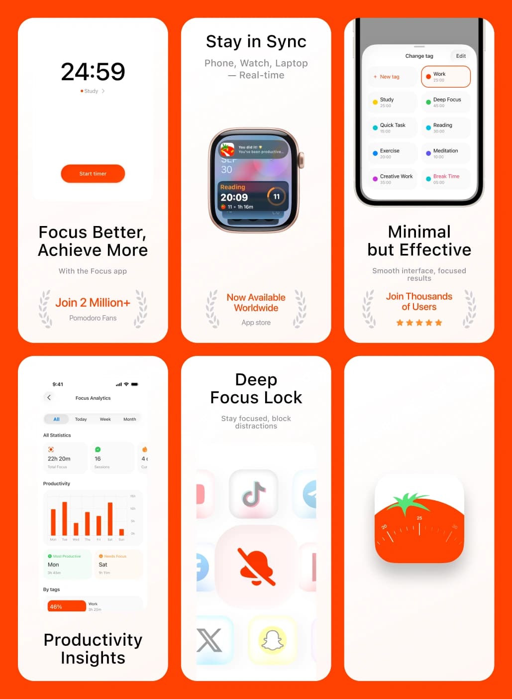
The timer lives outside the app too: Home Screen widgets for one-tap starts, Live Activities on the Lock Screen and in the Dynamic Island, and App Store screenshots localised for ten markets.
//websters
Our team are developers who are passionate about growing your business by bringing the designers’ awesome ideas to life. The QA-testers make sure the ideas are not fucked up, and the managers are managers.
instagram
Andrej C.
Founder


Tim G.
Manager


Alex H.
Frontend Developer


Nikita L.
CTO


Nikita K.
Backend Developer


Daniil K.
Designer


Valeria R.
Designer


Vladimir K.
Backend Developer


Denis B.
Mobile Developer


Zhenya N.
Backend Developer


Oxana C.
Frontend Developer


Yulia I.
Designer