mylipz brand & ecommerce
A brand identity, packaging and online store built from scratch for a new lip-care line
Subject
MYLIPZ is a lip-care brand — tinted lip serums, lip balms across six flavours, and a lip plumper oil — built from scratch for a client entering the category with no product identity, no packaging and no store yet. We designed the brand end to end: visual identity, packaging for every product line, and the online store it launched through.
What have we done
- Designed a full visual identity for a brand launching from zero — logotype, colour system and packaging language.
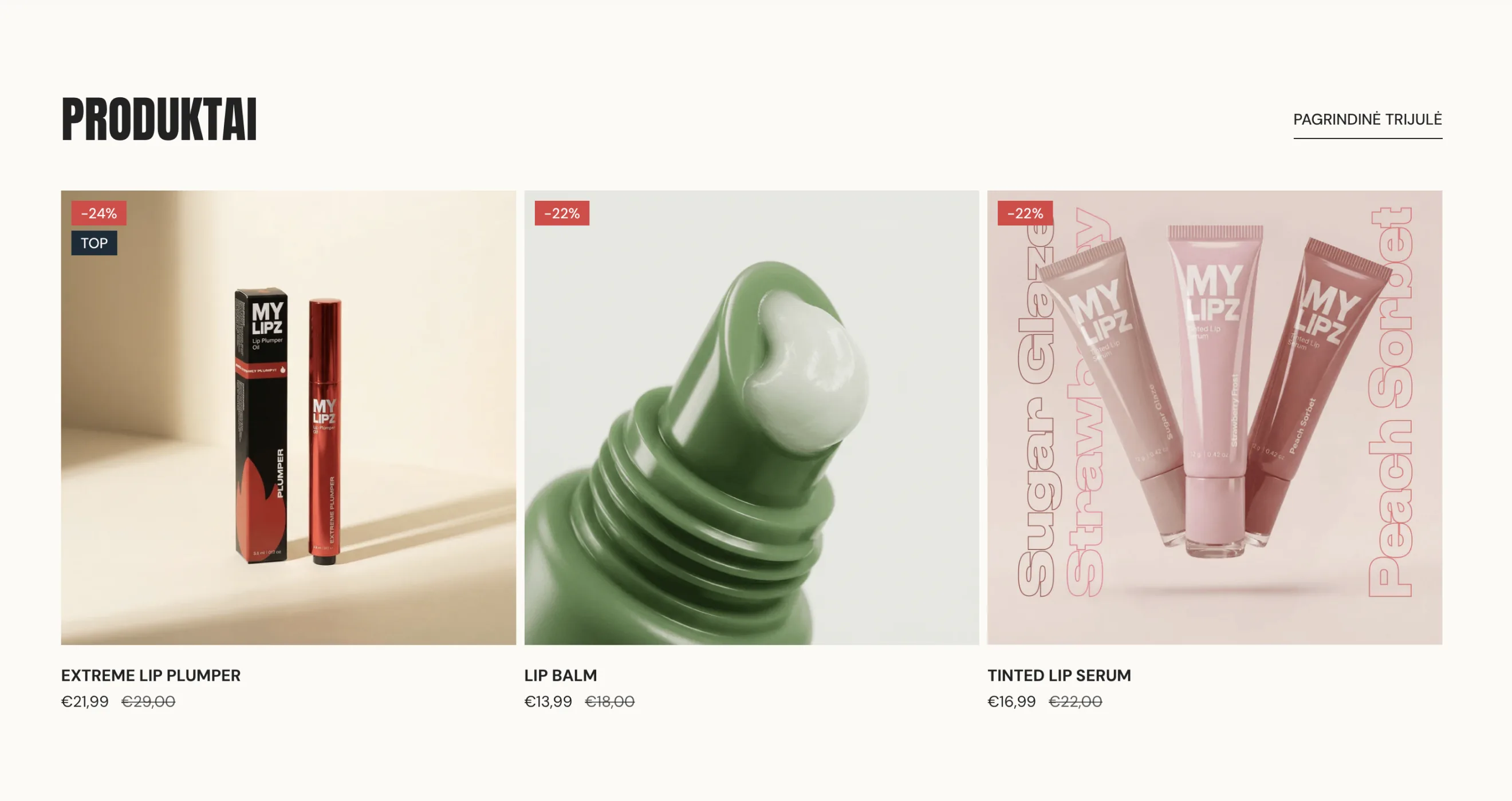
- Designed packaging for three product lines — tinted lip serum, lip balm, and lip plumper oil — across six flavour variants.
- Built a dedicated colour system for the tinted serum range, matched to real production swatches rather than a mood board.
- Designed and built the MYLIPZ online store — product listings, pricing and checkout.
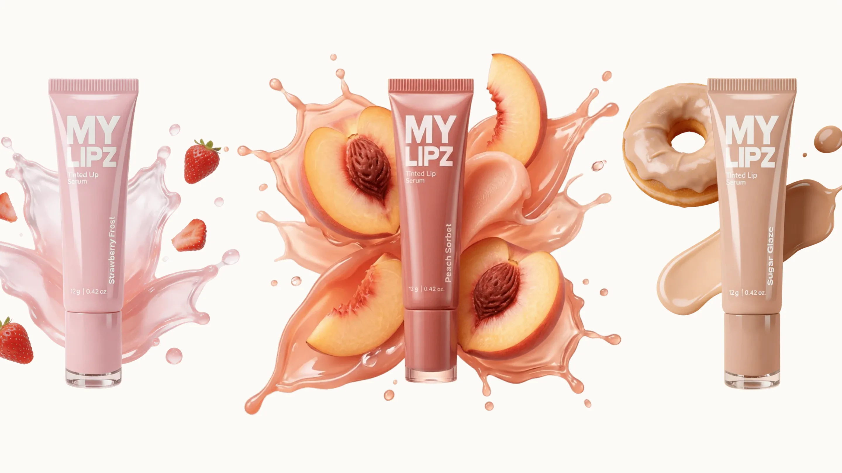
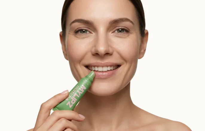
- Art-directed product photography, tying each shade to its flavour with fruit-splash visuals.
Task
The client had a category to enter and a product in development, but nothing to sell it with — no name recognition, no packaging, no store. Lip care is a crowded, visual-first category where a shopper decides in seconds from a product photo, so the brand had to look established from day one, in two months with a two-person team.
Solution
We built the identity around the product itself — playful, fruit-led naming for each shade, carried through into packaging, product photography and the online store. Product shots lean into the flavour rather than generic beauty photography: serum tubes shot mid-splash with real strawberries and peaches, so the shade reads before a shopper even sees the swatch. The store launched alongside the identity, and MYLIPZ now sells 200+ units a month.
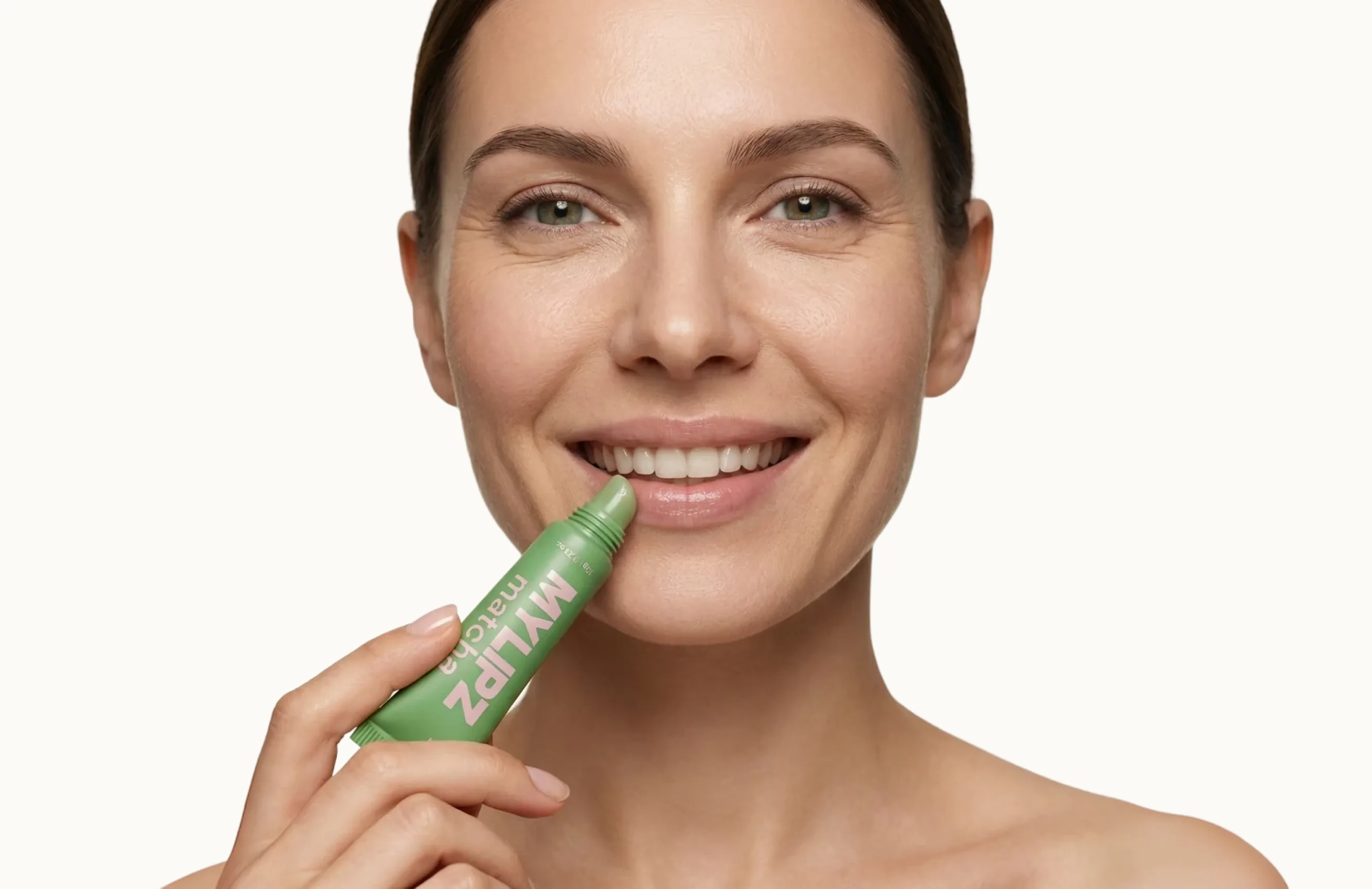
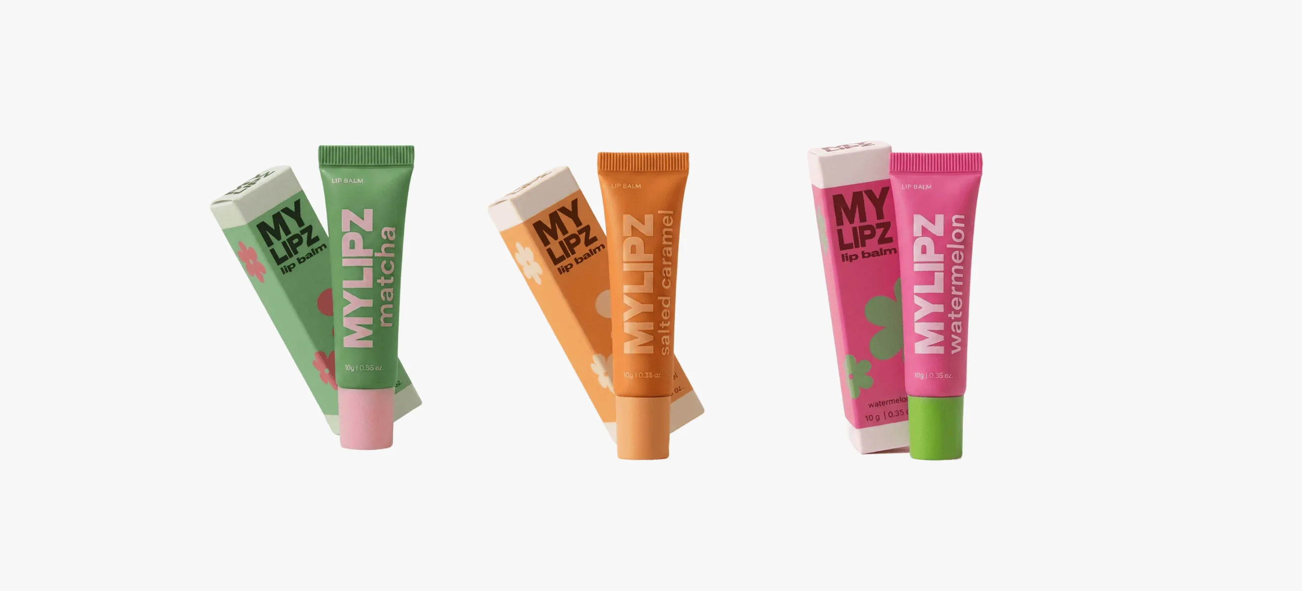
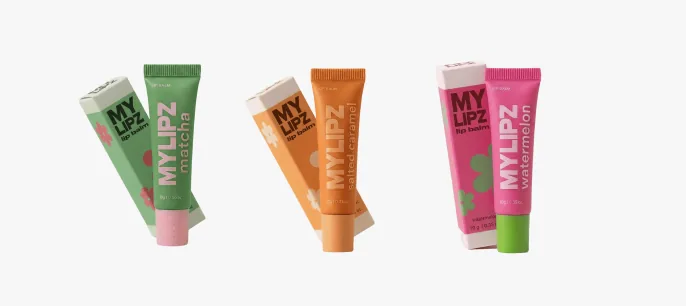
The lip balm range shipped in three flavours — Matcha, Salted Caramel, Watermelon — each with its own box and cap colour, so the line reads as a set on a shelf but still lets a shopper grab a single flavour without confusion.
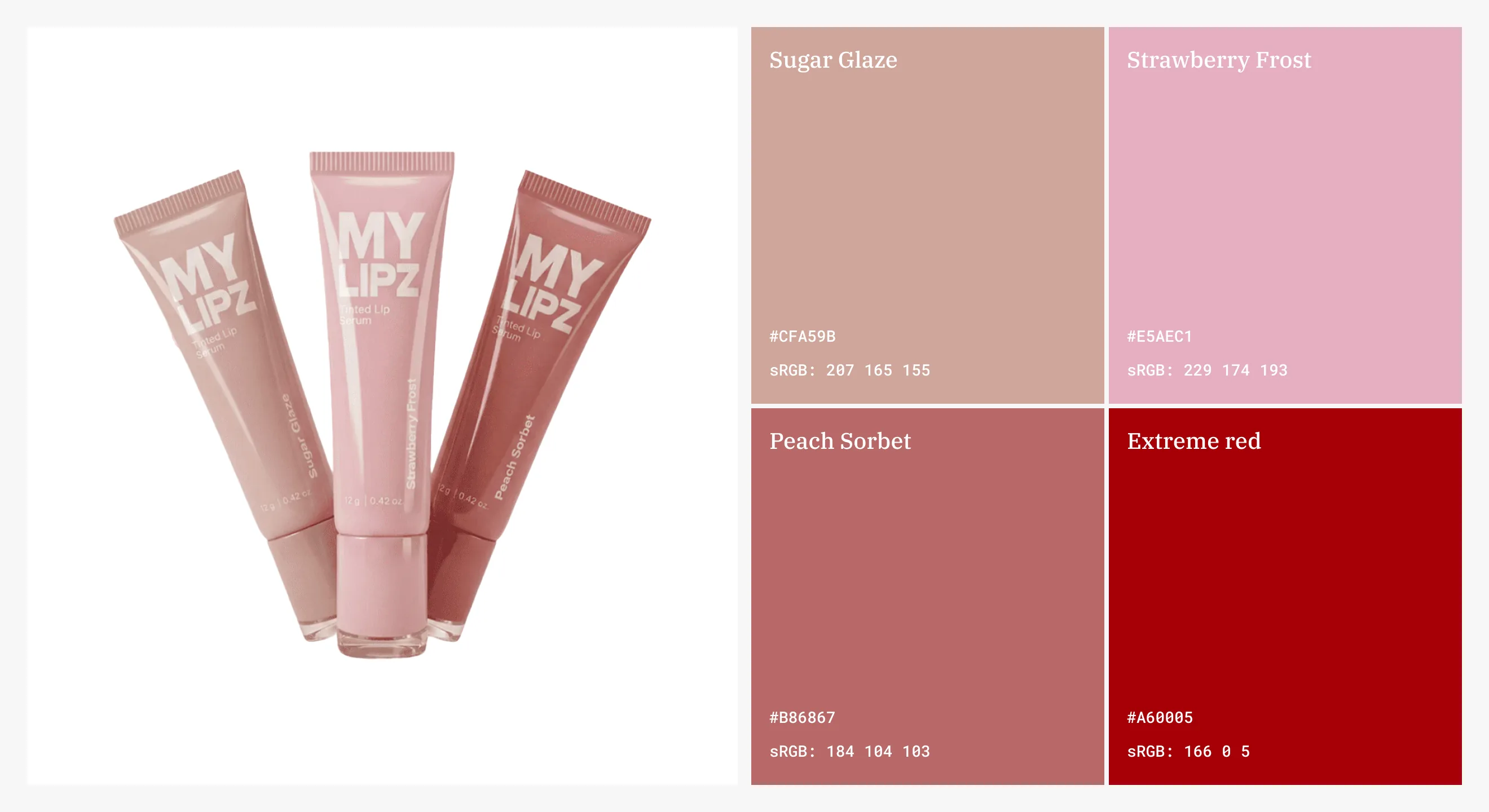
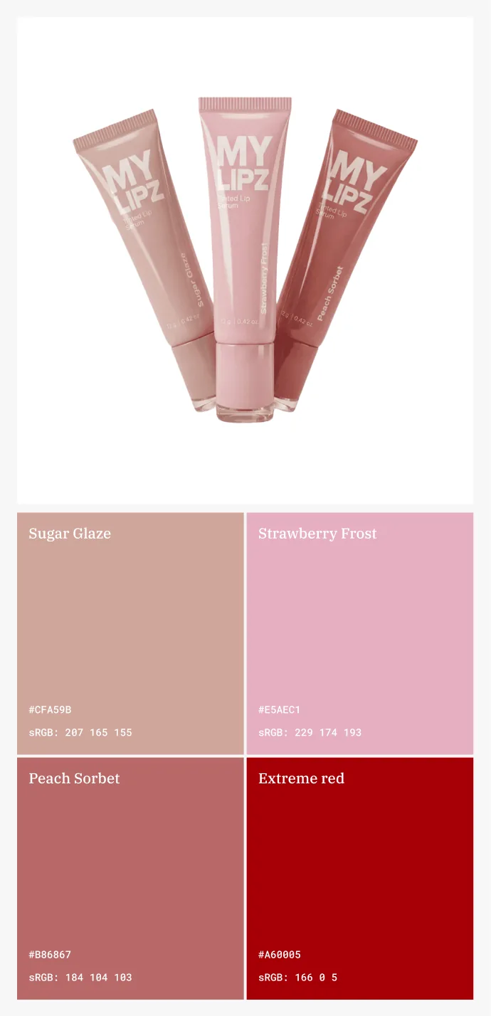
The tinted serum shades needed a colour system that matched what actually came out of production, not just a mood board — Sugar Glaze, Strawberry Frost, Peach Sorbet and Extreme Red were locked to real hex and sRGB values before packaging went to print.
That discipline is what let three separate product lines — serum, balm, plumper — launch under one identity without looking like three different brands sharing a logo.
//websters
Our team are developers who are passionate about growing your business by bringing the designers’ awesome ideas to life. The QA-testers make sure the ideas are not fucked up, and the managers are managers.
instagram
Andrej C.
Founder


Tim G.
Manager


Alex H.
Frontend Developer

Nikita L.
CTO


Nikita K.
Backend Developer


Daniil K.
Designer

Valeria R.
Designer

Vladimir K.
Backend Developer


Denis B.
Mobile Developer


Zhenya N.
Backend Developer

Oxana C.
Frontend Developer

Yulia I.
Designer