inflomega brand & pitch design
Website, packaging and an investor deck for a clinical-grade anti-inflammaging supplement
Subject
INFLOMEGA is a clinical-grade supplement built on a patented synbiotic technology that converts Omega-3 into resolvins — the molecules the body uses to actively resolve inflammation rather than just suppress it. The same product is sold through the VOLMI store, but INFLOMEGA needed its own identity and a set of materials well beyond a product page: a website, packaging, a box insert, and an investor-facing pitch deck. The client supplied the science — peer-reviewed studies, market sizing, clinical claims — and we designed how all of it looked and read.
What have we done
- Designed a dark, science-led visual identity built around the "inflammaging" story — bacteria, molecules and lab-grade imagery instead of generic wellness photography.
- Designed and built the INFLOMEGA website, translating clinical claims and study references into a page a first-time visitor can actually follow.
- Designed the product packaging — bottle and label.
- Designed the box insert explaining the science and dosage to someone already holding the product.
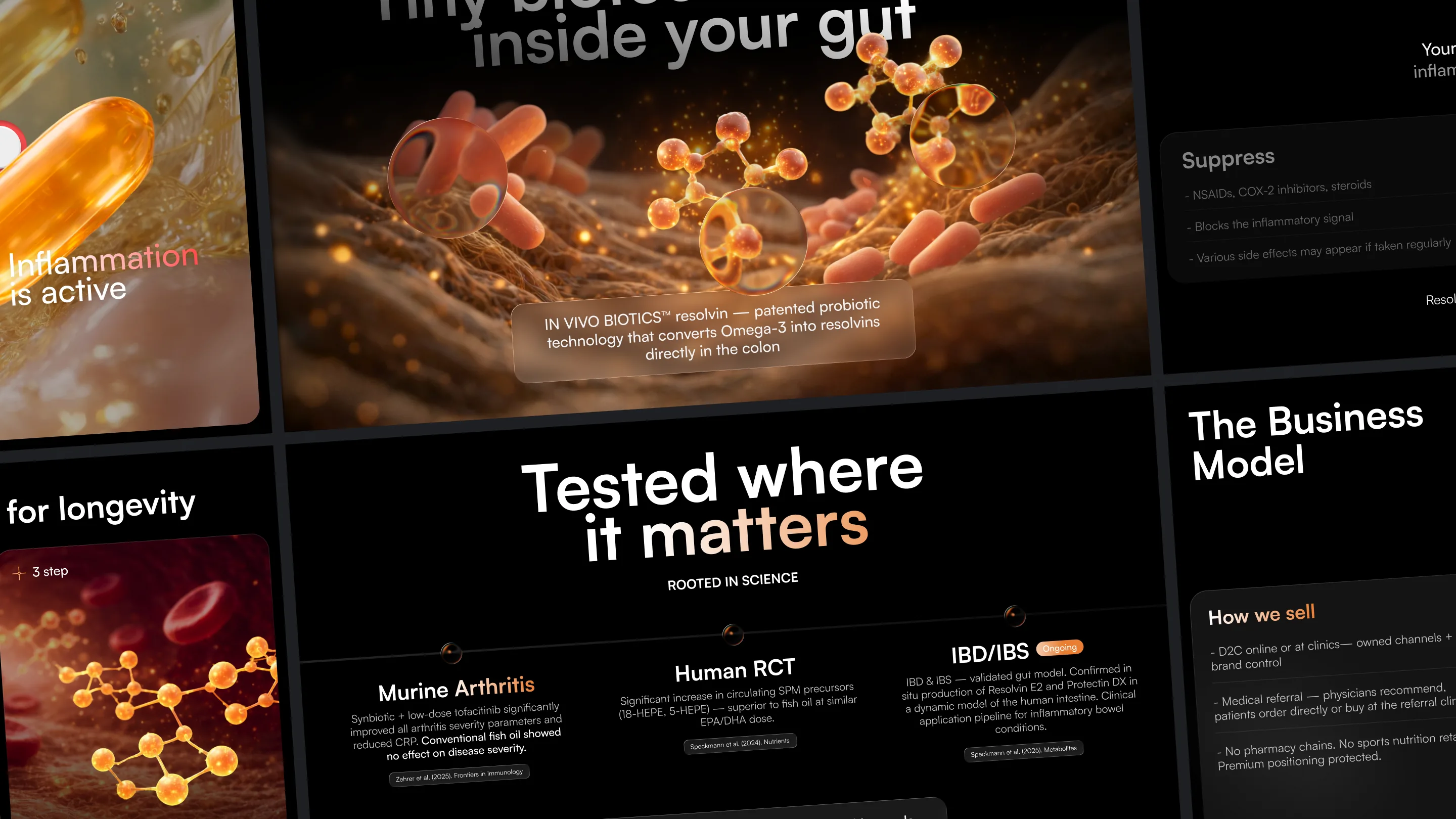
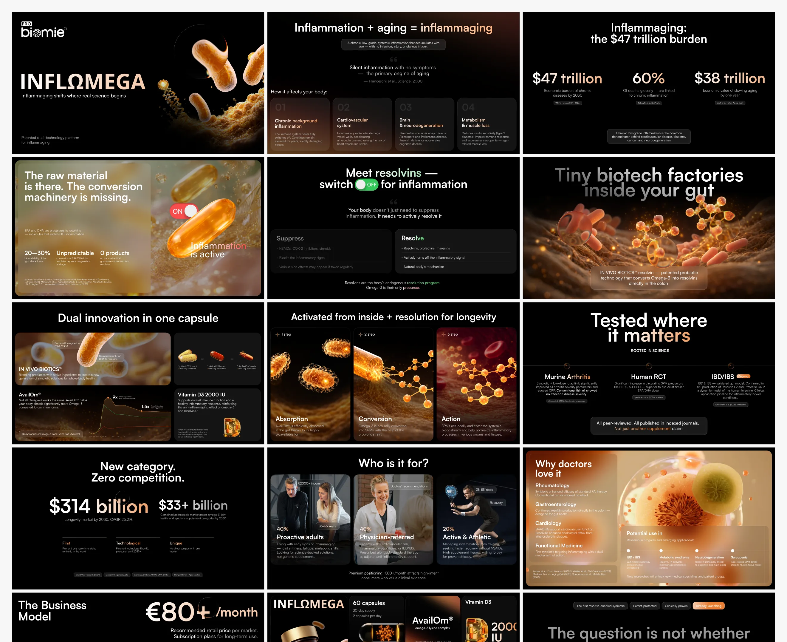
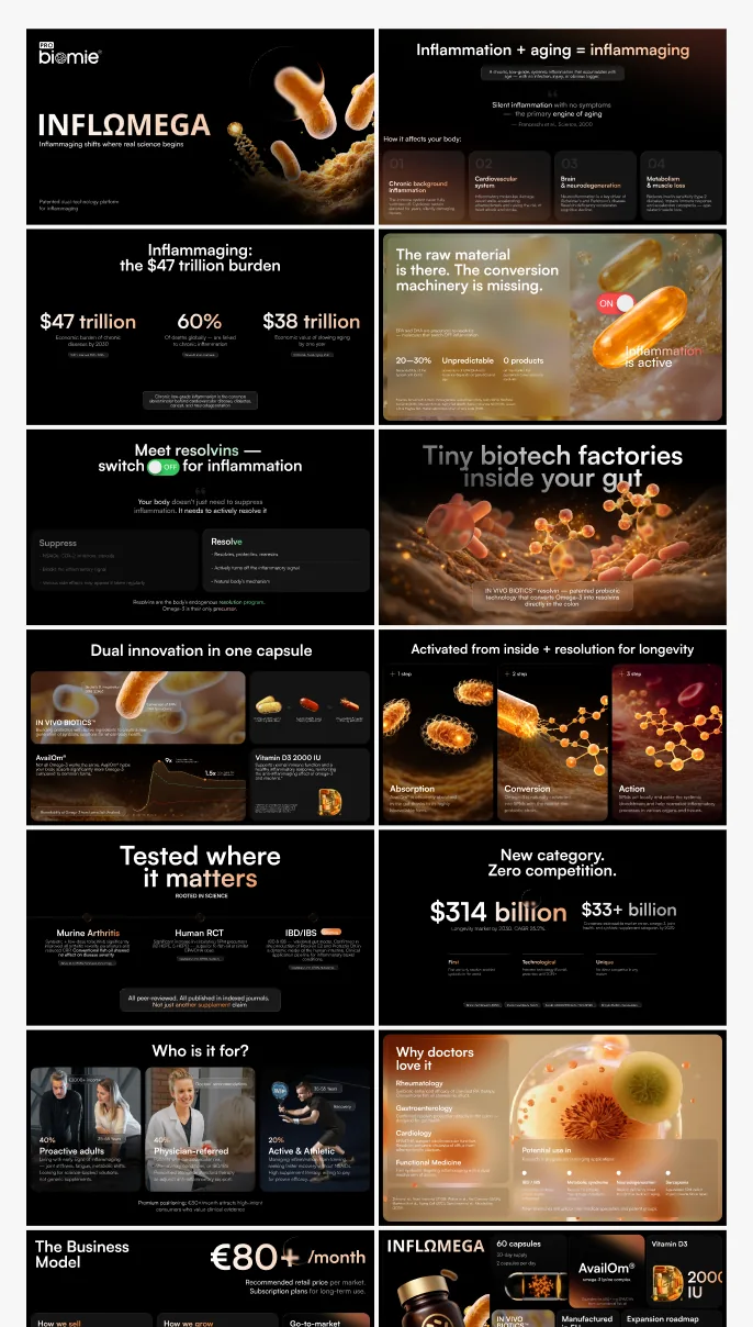
- Designed an investor-facing pitch deck covering the market opportunity, the technology, clinical evidence and the business model.


Task
The client had the hard part done — a patented technology, peer-reviewed studies, a defined market and a business model — but none of it had a visual language yet. Explaining "inflammaging" and resolvins to three different audiences at once (consumers, doctors, investors) in one month, with a two-person team, meant every format had to share one system instead of being designed from scratch each time.
Solution
We built one dark, lab-grade visual language — the same typography, colour logic and biotech imagery — and reused it across every format instead of restyling for each audience. The website leads with the "inflammaging" concept before the product itself, because the science is the differentiator, not the bottle. The same system scales down into the packaging and insert for someone who already bought it, and scales up into the pitch deck for whoever is deciding whether to fund or stock it.


The same visual system carries into the packaging and the box insert — dosage, ingredient sourcing and the "why this works" explanation someone reads while already holding the bottle, not while browsing a website.


The pitch deck is built for a different reader entirely — an investor or a pharmacy buyer skimming for market size, competitive moat and unit economics, not the mechanism of resolvins.
It keeps the same dark, lab-grade visual language as the site and packaging, but reorganizes the same science into market sizing, a subscription-based business model, and a doctor-facing positioning slide — one story told at three different altitudes.
//websters
Our team are developers who are passionate about growing your business by bringing the designers’ awesome ideas to life. The QA-testers make sure the ideas are not fucked up, and the managers are managers.
instagram
Andrej C.
Founder


Tim G.
Manager


Alex H.
Frontend Developer


Nikita L.
CTO


Nikita K.
Backend Developer


Daniil K.
Designer


Valeria R.
Designer


Vladimir K.
Backend Developer


Denis B.
Mobile Developer


Zhenya N.
Backend Developer


Oxana C.
Frontend Developer


Yulia I.
Designer