artglacio brand and website
A gallery-styled website and brand visuals for a Lithuanian ice cream maker
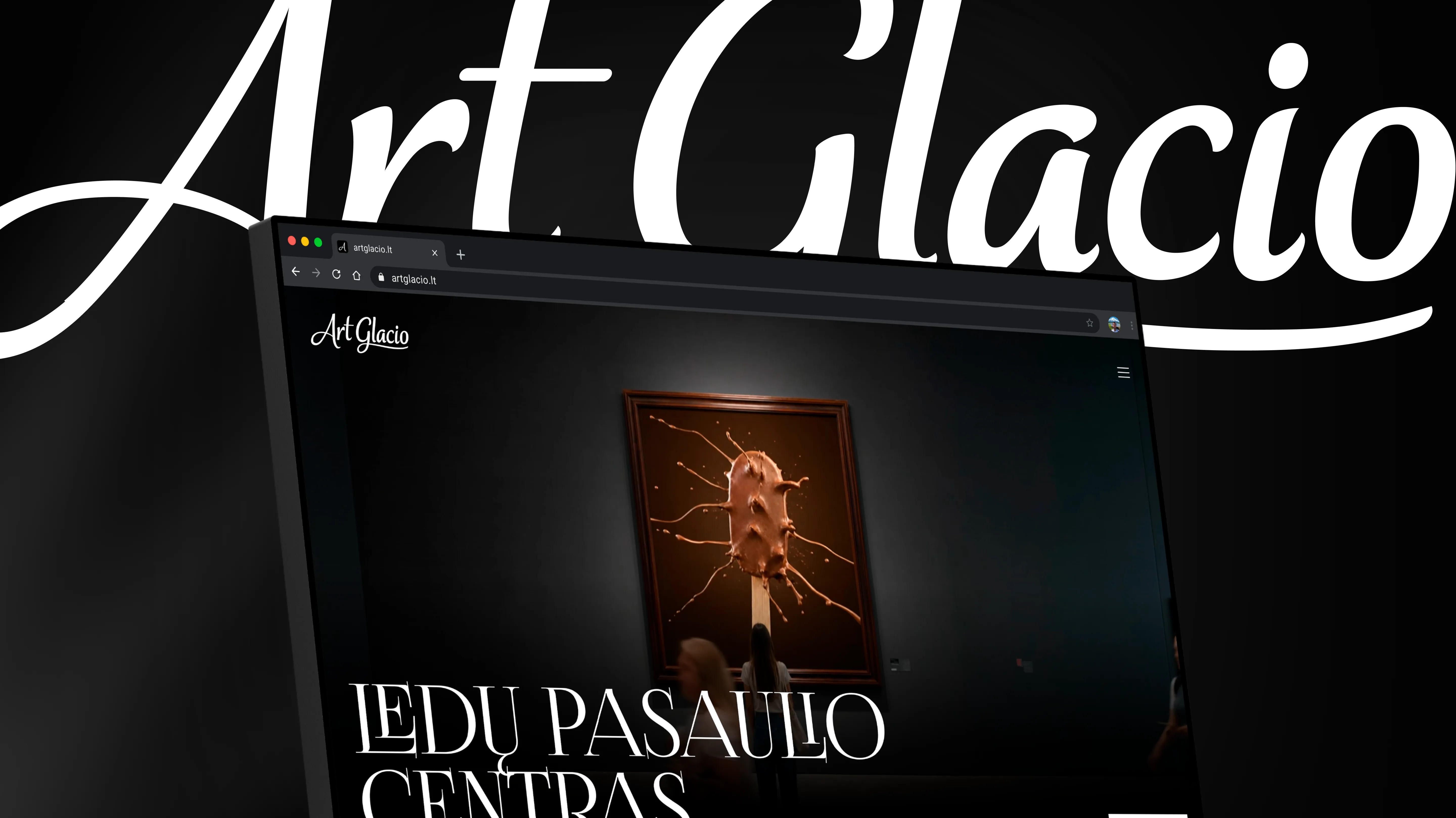
Subject
ArtGlacio is a Lithuanian ice cream maker built around two flavour lines, Spells and Nostalgia. They needed a brand presence that felt as crafted as the product itself — a website, packaging-style visuals and the physical materials that carry the brand from the shelf to the trade-show floor.
What have we done
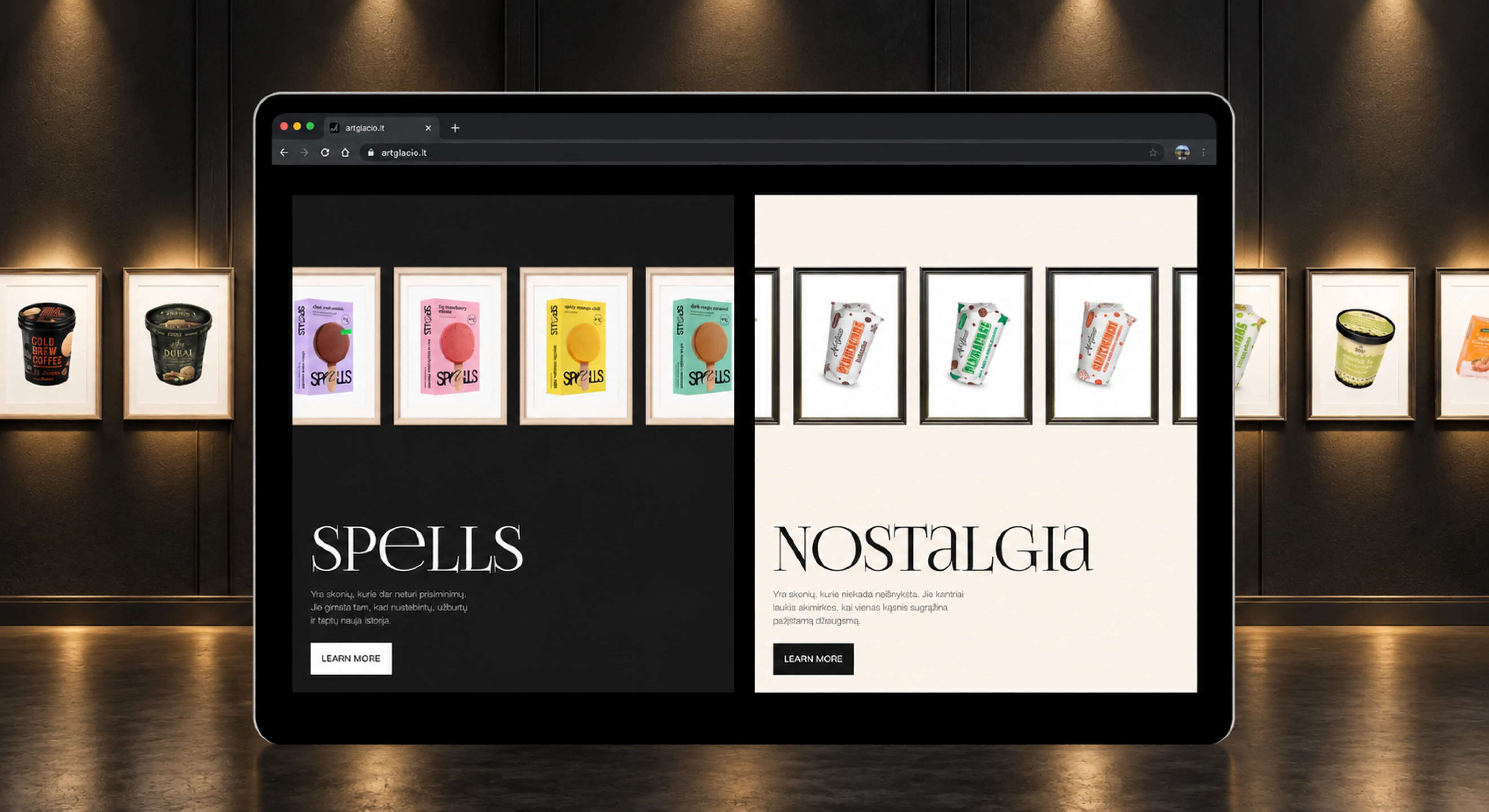
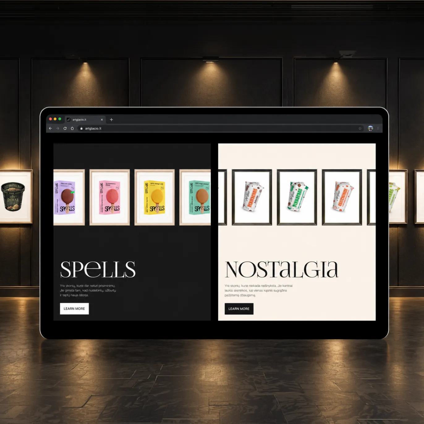
- Designed and built a gallery-styled website — ice cream packaging displayed like framed art, anchored by a map placing Vilkaviškis as the brand’s "ice cream world center."
- Told the brand’s production story as a four-step gallery walk — from the idea, through taste tests and packaging design, to production.
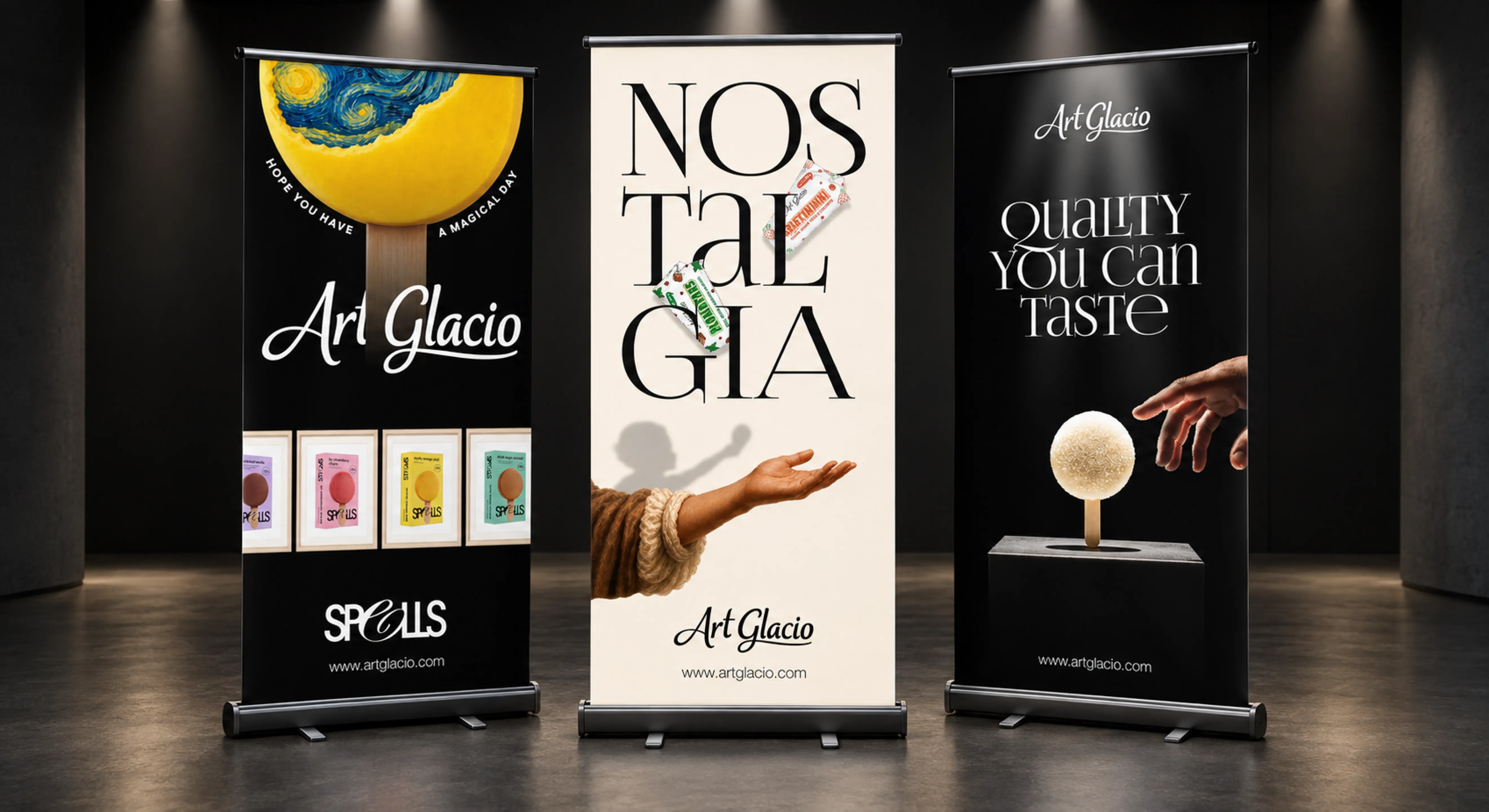
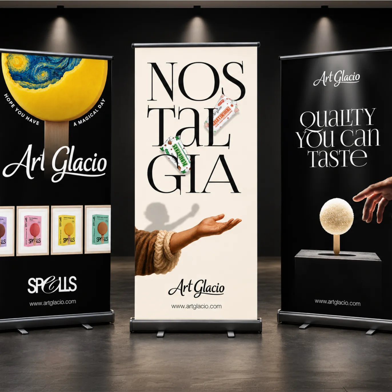
- Designed roll-up banners for the Spells and Nostalgia lines, carrying the "Quality you can taste" and "Creators of joy" taglines.
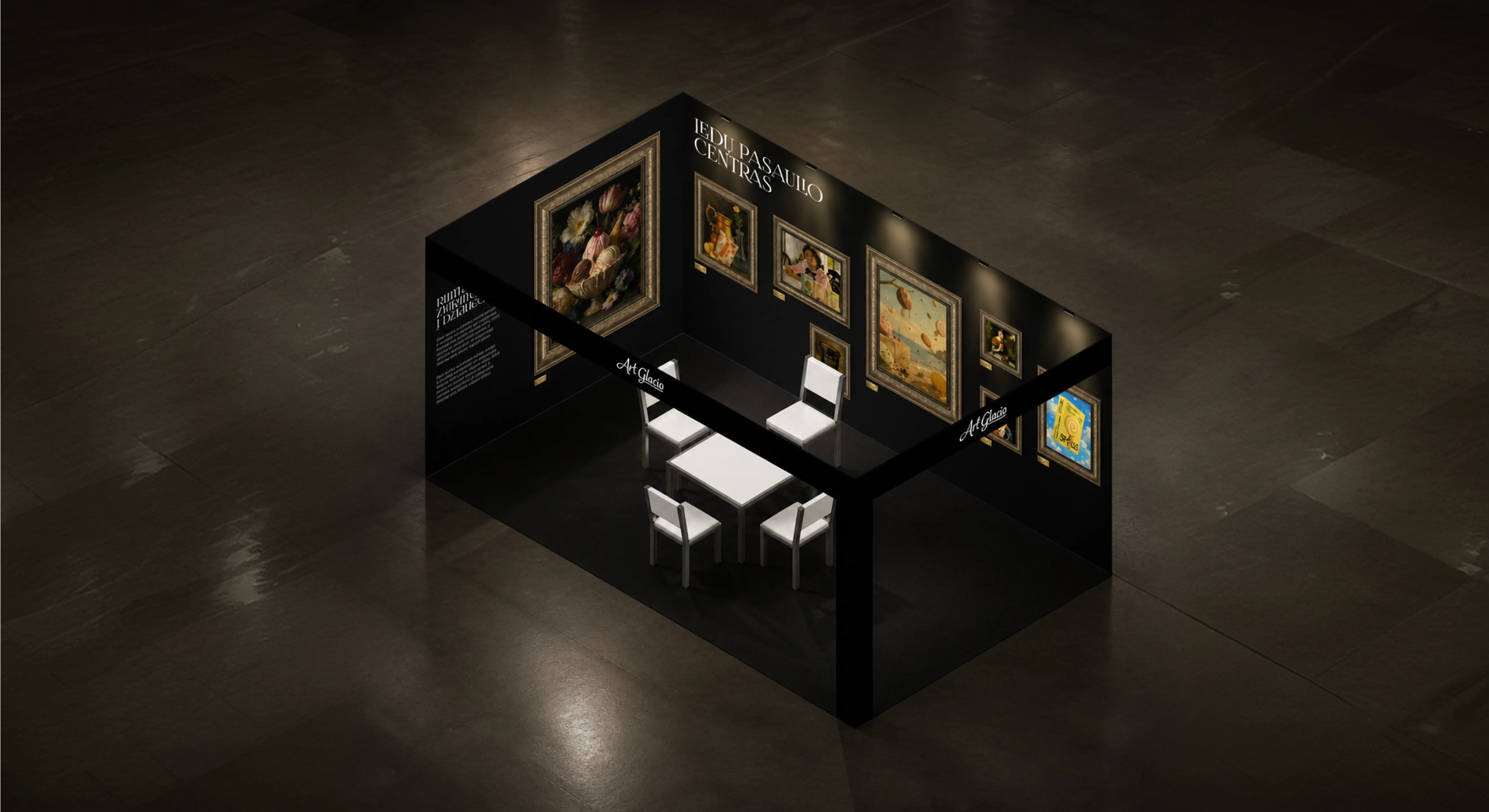
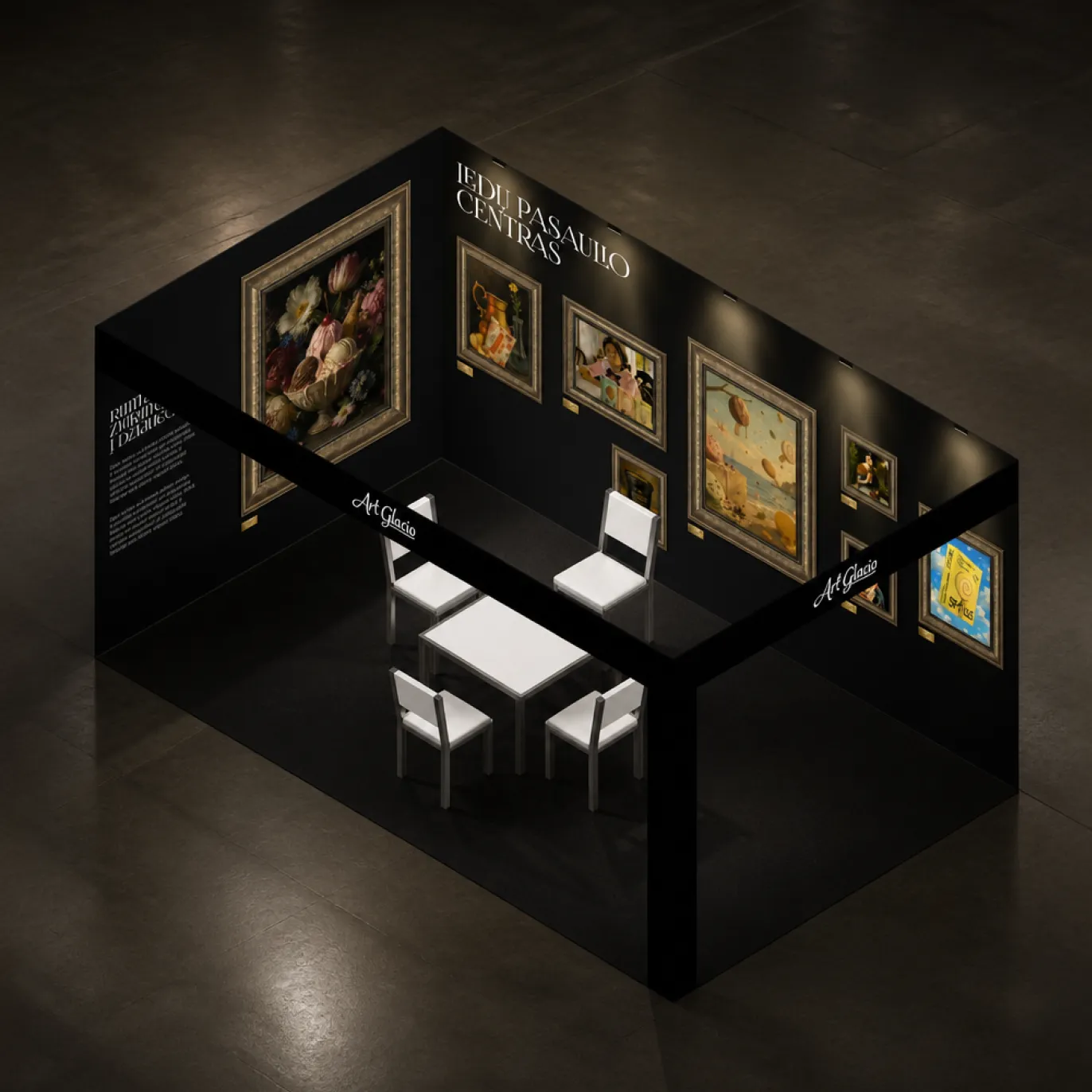
- Designed an exhibition stand carrying the same gallery aesthetic — framed art, a clean palette — into physical trade-show space.
Task
The brand needed to read as premium and crafted without slipping into generic "artisan" clichés — and it needed to feel identical whether someone met it online, on a shop shelf, or walking a trade-show floor.
Solution
We leaned into an actual gallery metaphor — packaging presented like framed exhibits, a map placing Vilkaviškis as the "ice cream world center," and the same visual language carried through onto the roll-up banners and the stand itself, so the story reads the same everywhere it shows up.
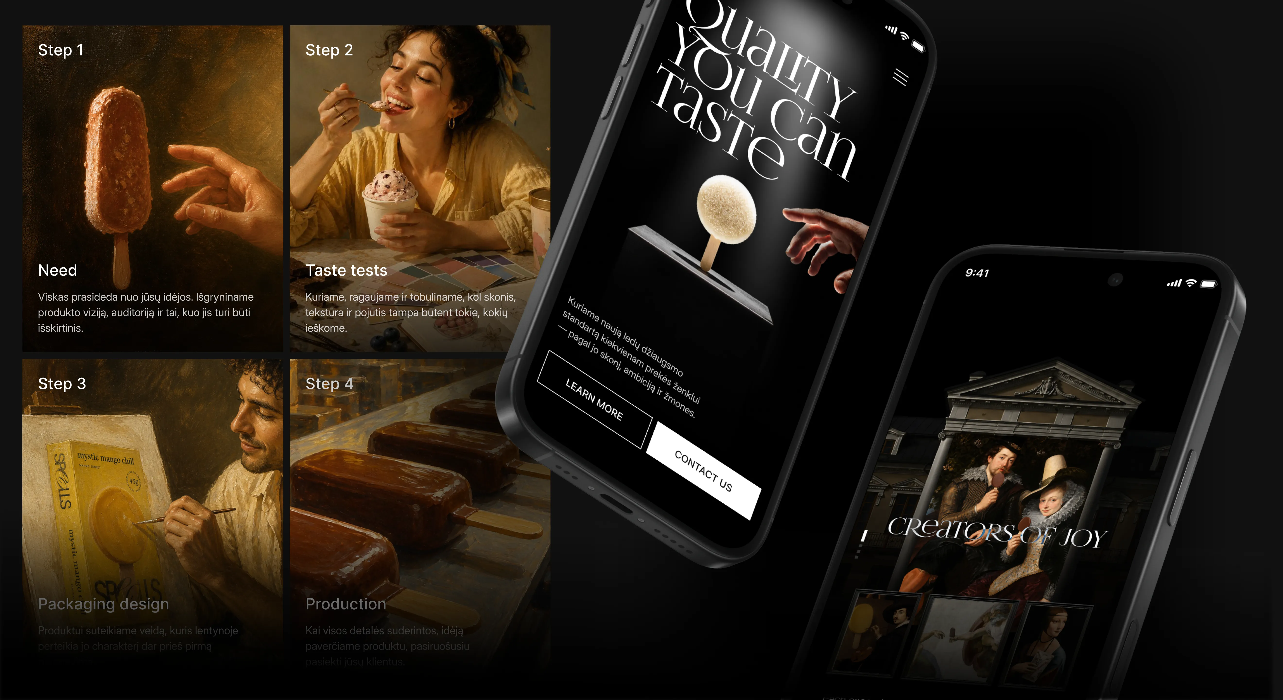
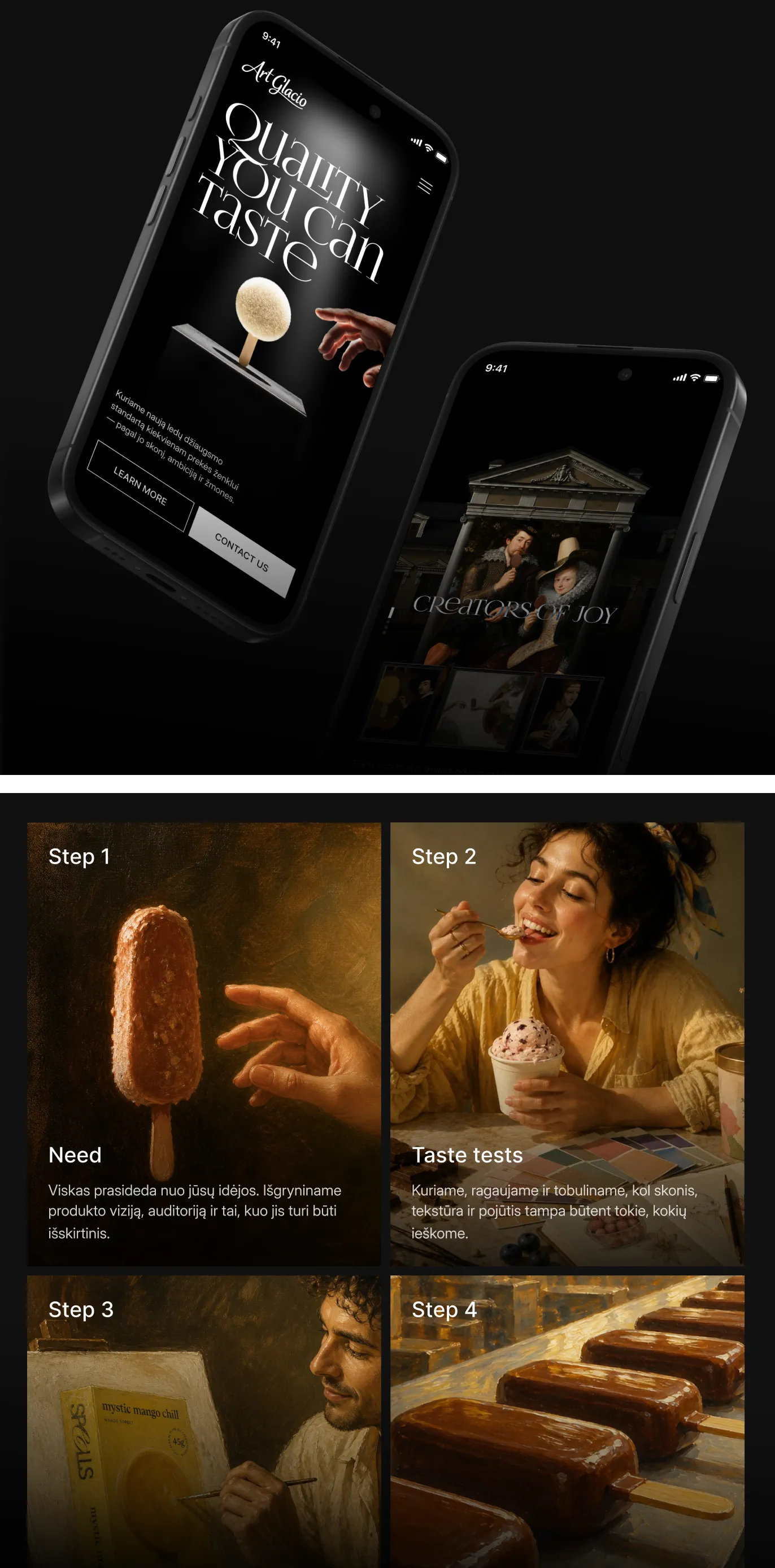
The four steps mirror how the product itself comes together — from a rough idea, to a taste worth remembering, to a package that sells it on the shelf.
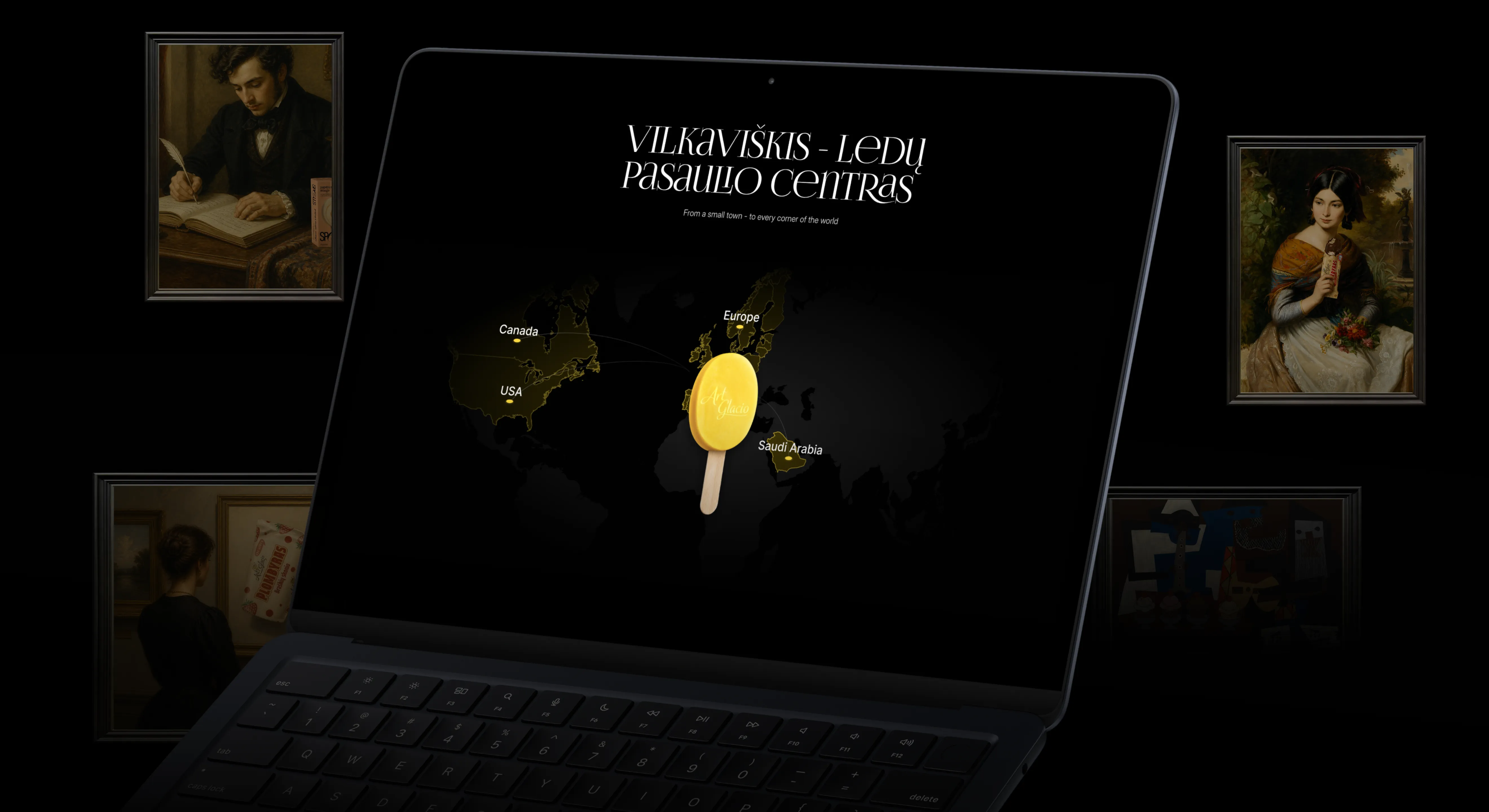
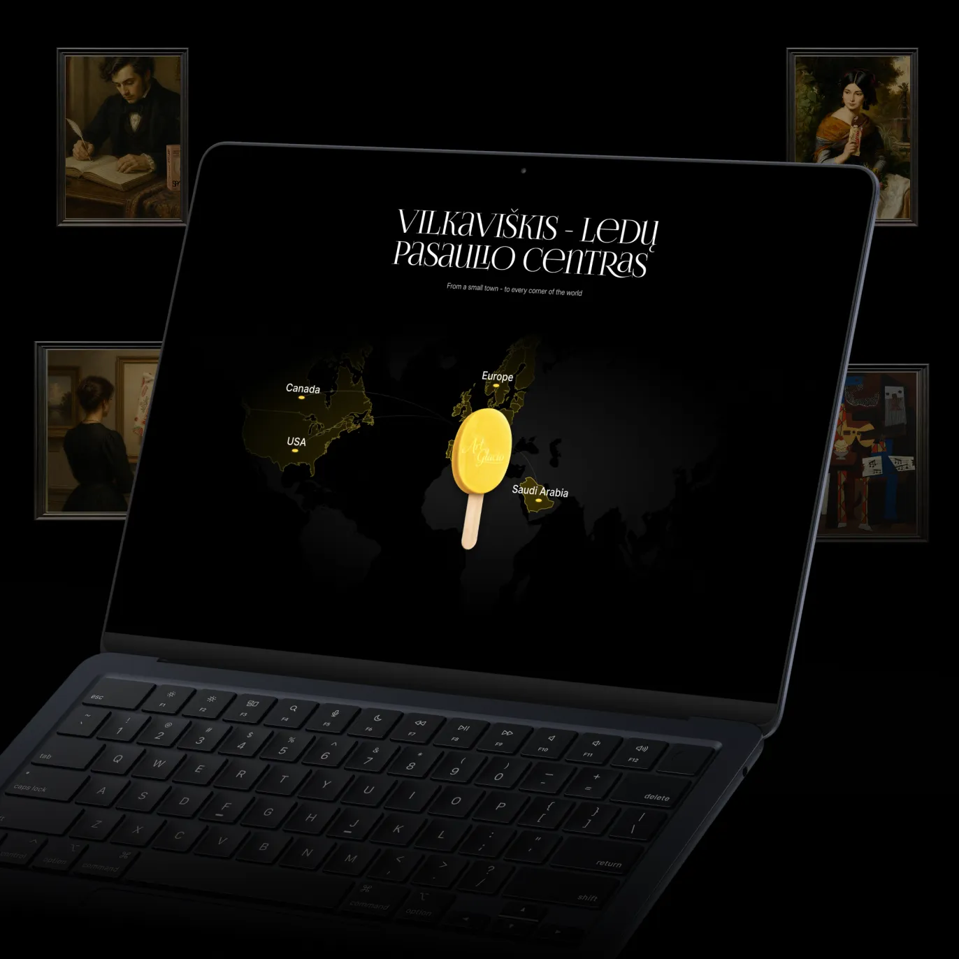
Vilkaviškis anchors the story as the brand’s "ice cream world center" — a small, confident claim that sets the tone for the rest of the site.
The framed-portrait gallery treatment carries through consistently, so packaging photography reads with the same weight as the copy around it.
//websters
Our team are developers who are passionate about growing your business by bringing the designers’ awesome ideas to life. The QA-testers make sure the ideas are not fucked up, and the managers are managers.
instagram
Andrej C.
Founder


Tim G.
Manager


Alex H.
Frontend Developer


Nikita L.
CTO


Nikita K.
Backend Developer


Daniil K.
Designer


Valeria R.
Designer


Vladimir K.
Backend Developer


Denis B.
Mobile Developer


Zhenya N.
Backend Developer


Oxana C.
Frontend Developer


Yulia I.
Designer